
Cinnah 64
Auction House
- Year
- 2024 — Present · new identity 2026
- Role
- Brand designer
- Scope
- Logo family, colour palette, typography, poster system, web hero and banners, online auction UI (concept)
- Status
- Live, 8 auctions so far
- 01Brief
Artopia’s online auction house had outgrown a hand-drawn logo and a different poster for every sale. It needed one identity that works from an app icon to a printed paddle, and a system that produces a new auction quickly.
- 02Insight
An auction house is judged by trust and rhythm. Buyers should recognise the house at a glance, and every sale should feel like the next issue of the same series.
- 03Idea
Draw the house from three shapes, a circle, a triangle and a square, and let the same shapes cut every artwork it sells.
- 04System
A geometric wordmark and a 6/4 mark (the 6 drawn, the 4 cut) in a full family; seven named colours with clear jobs; Instrument Serif for titles and a rounded grotesque for facts; one poster frame where only the work and its geometry change.
- 05Applications
Auction posters, website hero and banners, the logo set for print and social media, and a concept for the online auction interface, built in code.
- 06Result
One brand that holds from a favicon to a poster, and a template that turns each new sale into a single decision: which work, which shape.
A Sub-brand of Artopia
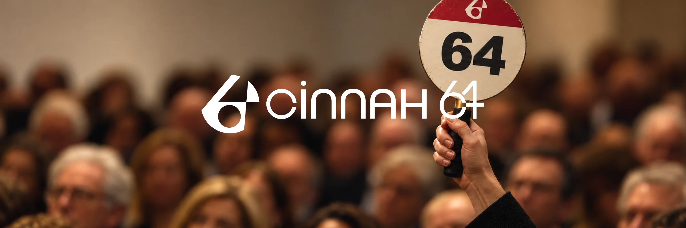
Cinnah 64 is the online auction house of Artopia, named after the gallery’s address, 64 Cinnah Caddesi in Ankara. It shares the gallery’s values but speaks in a different register: where Artopia is calm and editorial in ink and canvas, Cinnah 64 is geometric and live, in red, black and catalogue paper. The two marks share one form, the circle: the Artopia ellipse returns as the circle that holds the whole Cinnah 64 mark.
The Logo Family
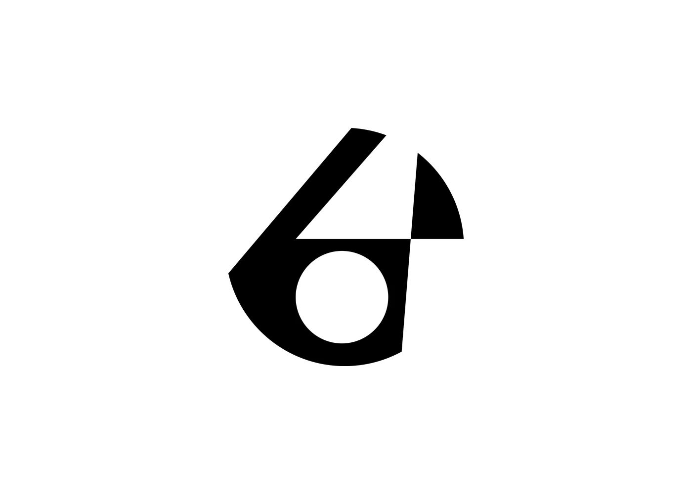
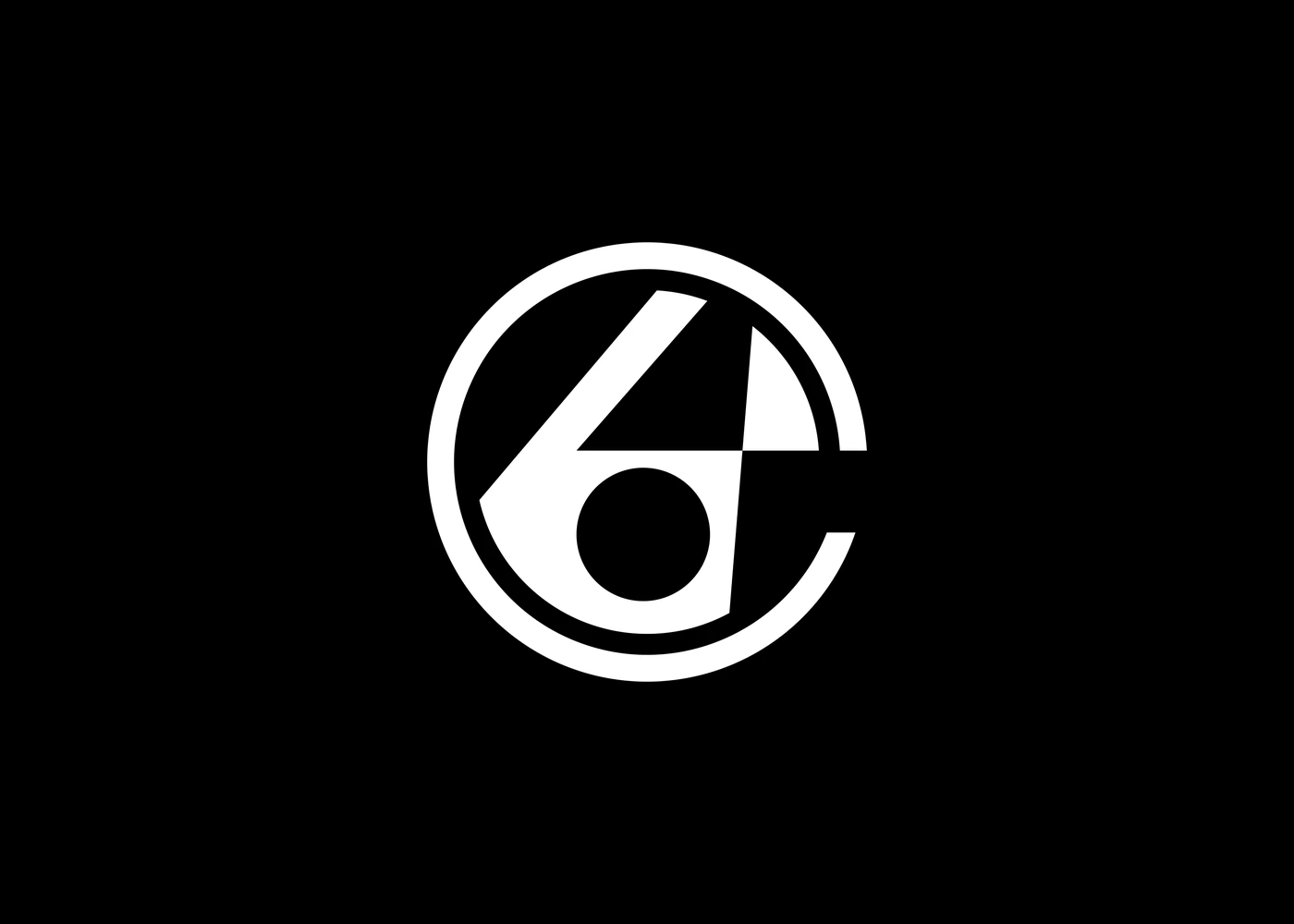
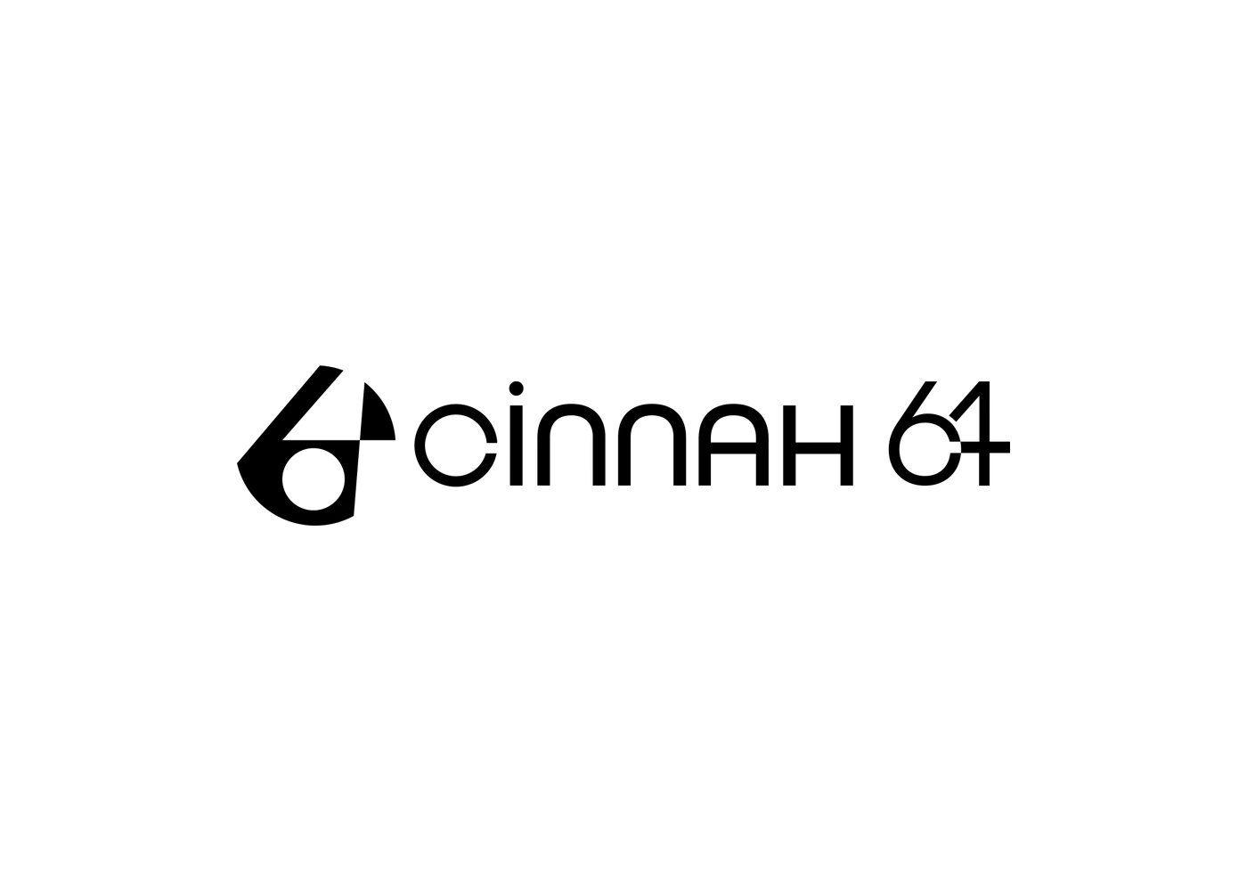
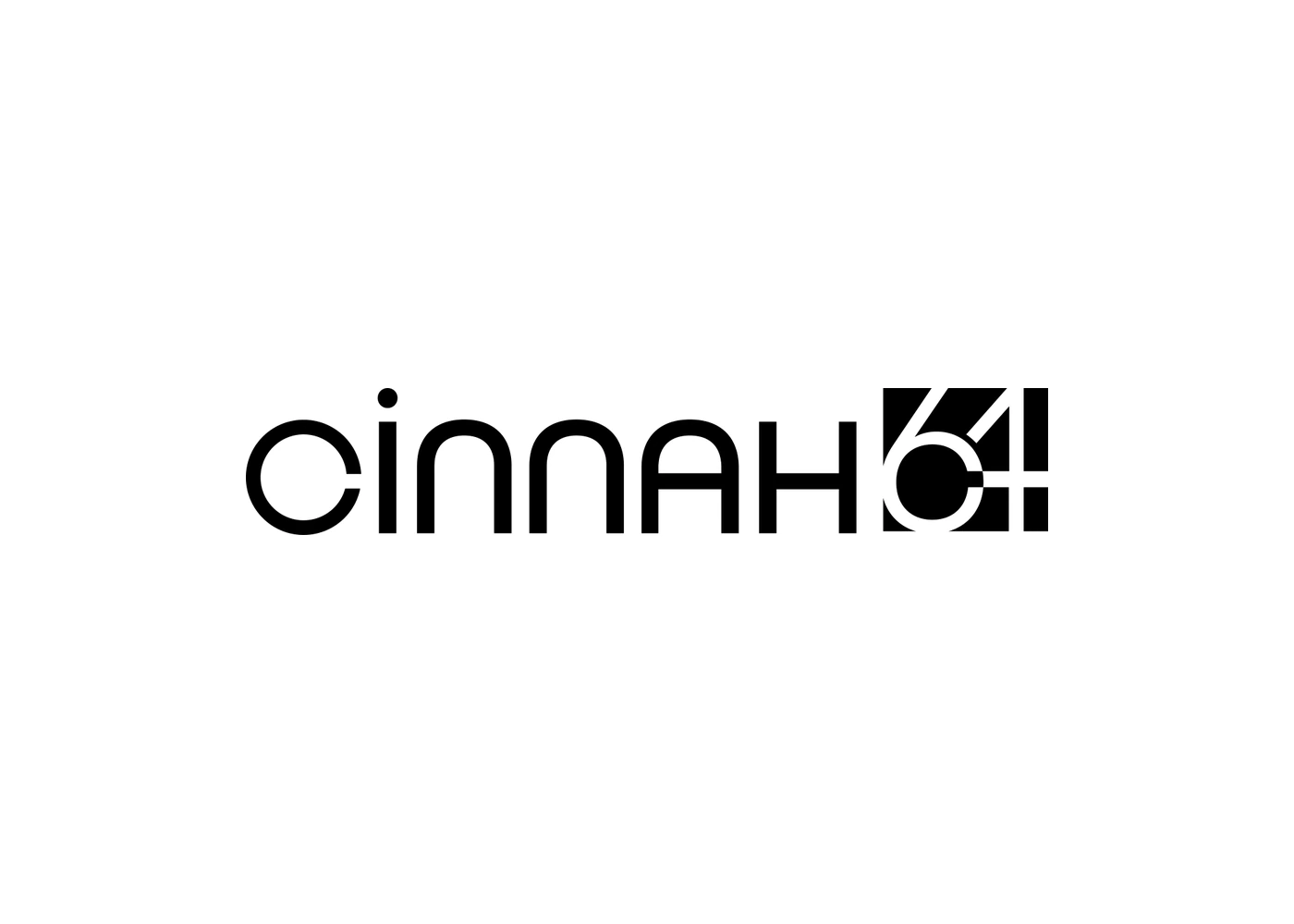
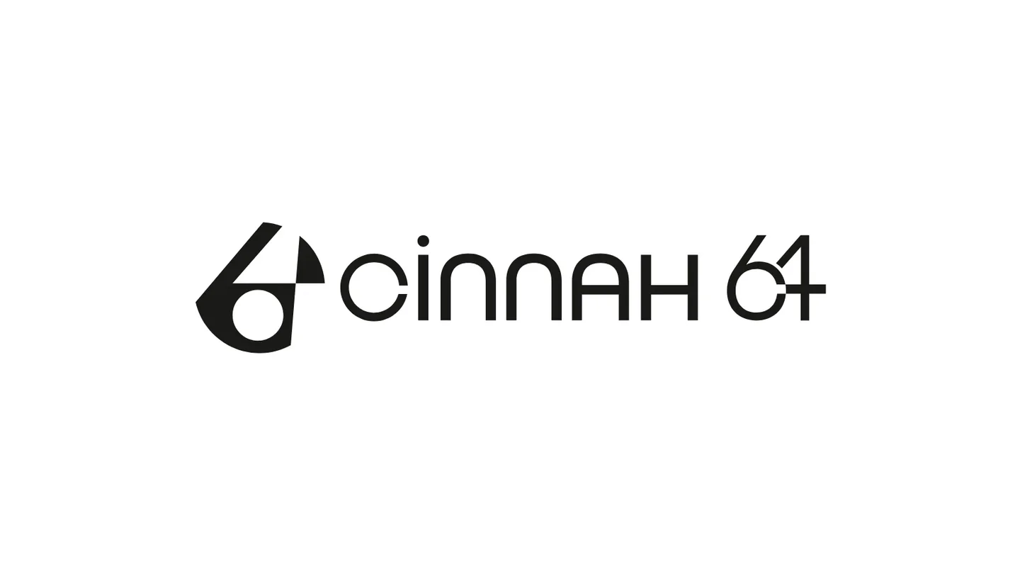
The mark joins a 6 and a 4 in one figure. A single circle holds it and draws the 6; the 4 is cut into that circle, its diagonal, crossbar and stem left as gaps, so the 6 is the shape and the 4 is the cut. A second circle makes the counter, and clear space is the width of that counter.
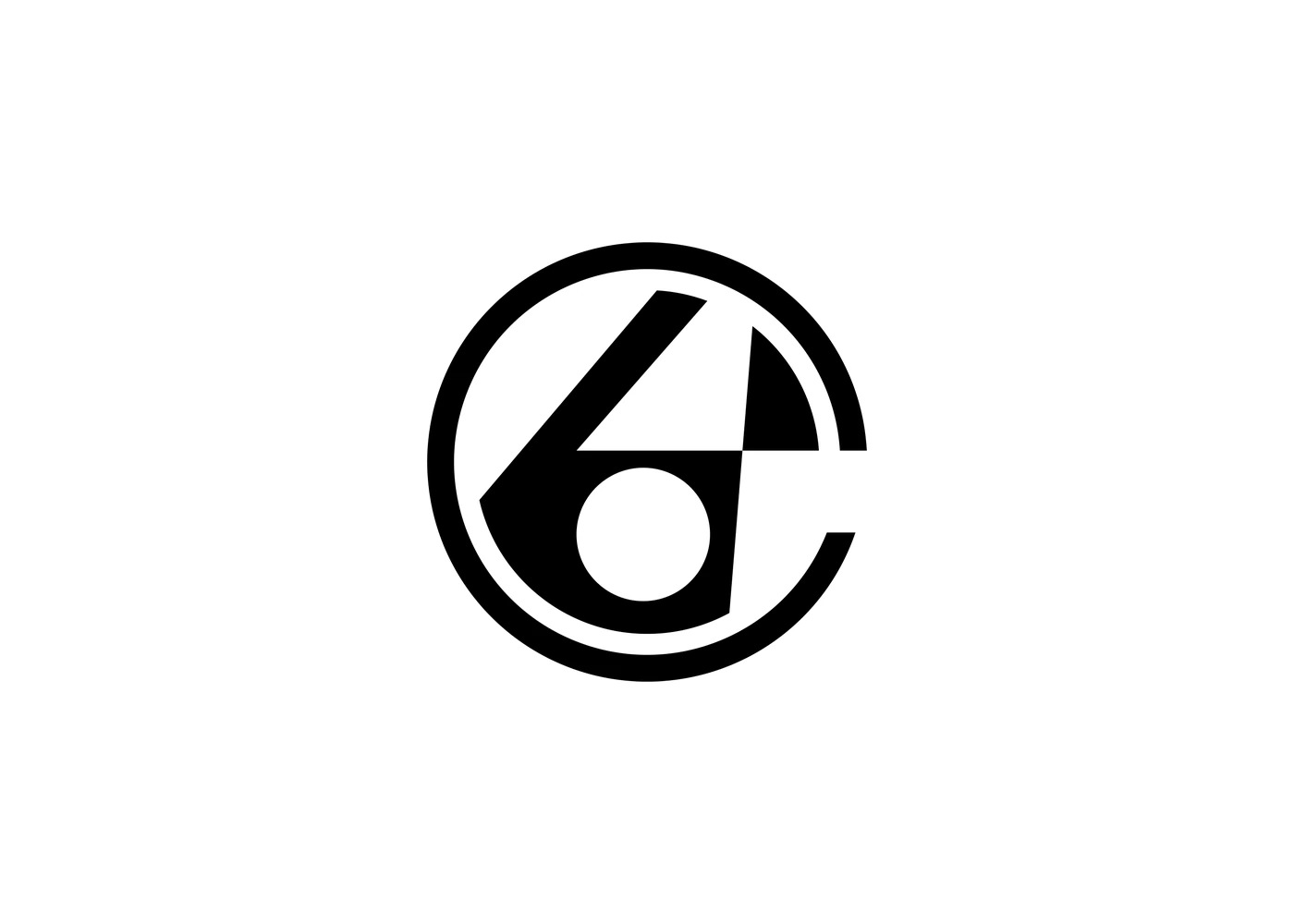
In the seal a ring surrounds the mark, broken on the right: the broken ring is the C of Cinnah, so the seal spells the whole name. The mark also works alone at small sizes and next to a geometric wordmark.
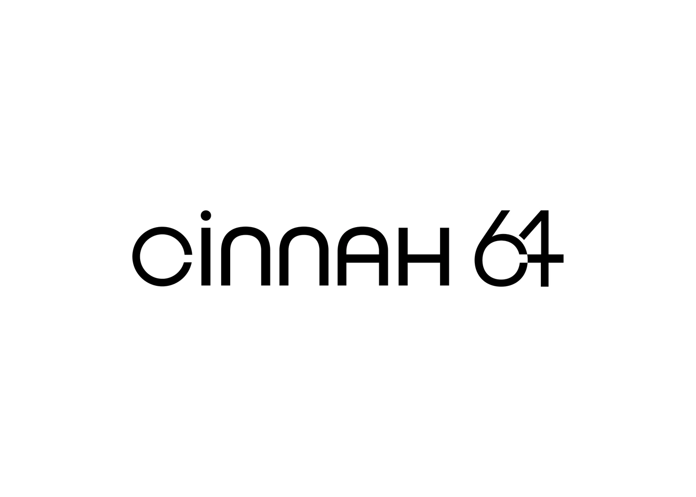
In the wordmark’s 64, the crossbar of the 4 runs into the 6 and cuts its bowl open: a nod to the broken ring that stands for the C, and, seen from above, an auctioneer’s gavel, the bowl as its head and the crossbar as its handle.
 First identity2026
Seven Colours with a Job
Every colour has a name taken from the auction or from the city, and a single job: Gavel Black for the gavel’s voice, Catalogue Paper for the printed catalogue, Cinnah Red only for the moments a decision is made, Reserve Grey as quiet as a reserve price. Andesite, Ankara’s building stone, is for screens; Kavaklıdere red for evening sales; Hammer Brass for foil only.
Gavel Black
Text · logo
- RGB
- 27 26 24
- CMYK
- 0 4 11 89
- Pantone
- ≈ Neutral Black C
Catalogue Paper
Ground
- RGB
- 242 238 230
- CMYK
- 0 2 5 5
- Pantone
- Paper stock, natural
Cinnah Red
Live · sold · final lots
- RGB
- 206 33 41
- CMYK
- 0 84 80 19
- Pantone
- ≈ 1795 C
Reserve Grey
Captions · lines
- RGB
- 112 108 101
- CMYK
- 0 4 10 56
- Pantone
- ≈ Warm Gray 10 C
Andesite
Screens · app
- RGB
- 42 40 38
- CMYK
- 0 5 10 84
- Pantone
- ≈ Black 7 C
Kavaklıdere
Evening sale · certificates
- RGB
- 110 31 43
- CMYK
- 0 72 61 57
- Pantone
- ≈ 7421 C
Hammer Brass
Foil · seals, never text
- RGB
- 176 137 79
- CMYK
- 0 22 55 31
- Pantone
- ≈ 872 C foil
CMYK and Pantone are approximate; confirm with a print proof. Click a colour to copy its HEX.
Two Voices
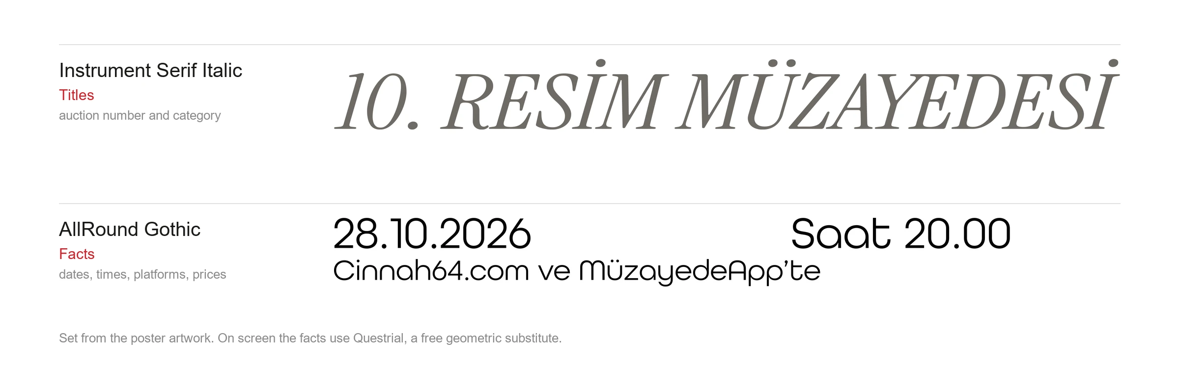
Instrument Serif Italic carries the titles: the auction number and category, set large, like the cover of a catalogue. AllRound Gothic, a rounded geometric sans that echoes the mark, carries the facts: dates, times, platforms and prices. On screen, where the Adobe font cannot be served, Questrial takes its place.
One Frame, Three Geometries
Every auction poster uses the same frame: the wordmark and the auction title at the top, the date, time and platforms at the bottom, the mark closing the corner, all on one left margin. Only the middle changes. Each sale gets one artwork and one of the three shapes of the mark, squares, circles or triangles, that cuts and repeats it, with Cinnah Red filling a few of the cells.
Producing a new auction becomes one decision instead of a new design: choose the work, choose the shape.
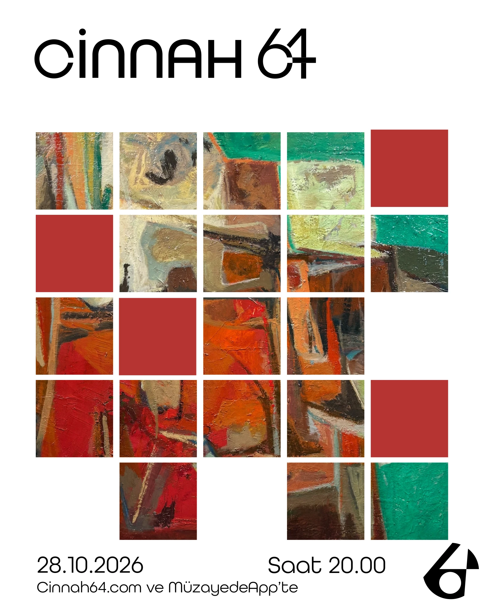
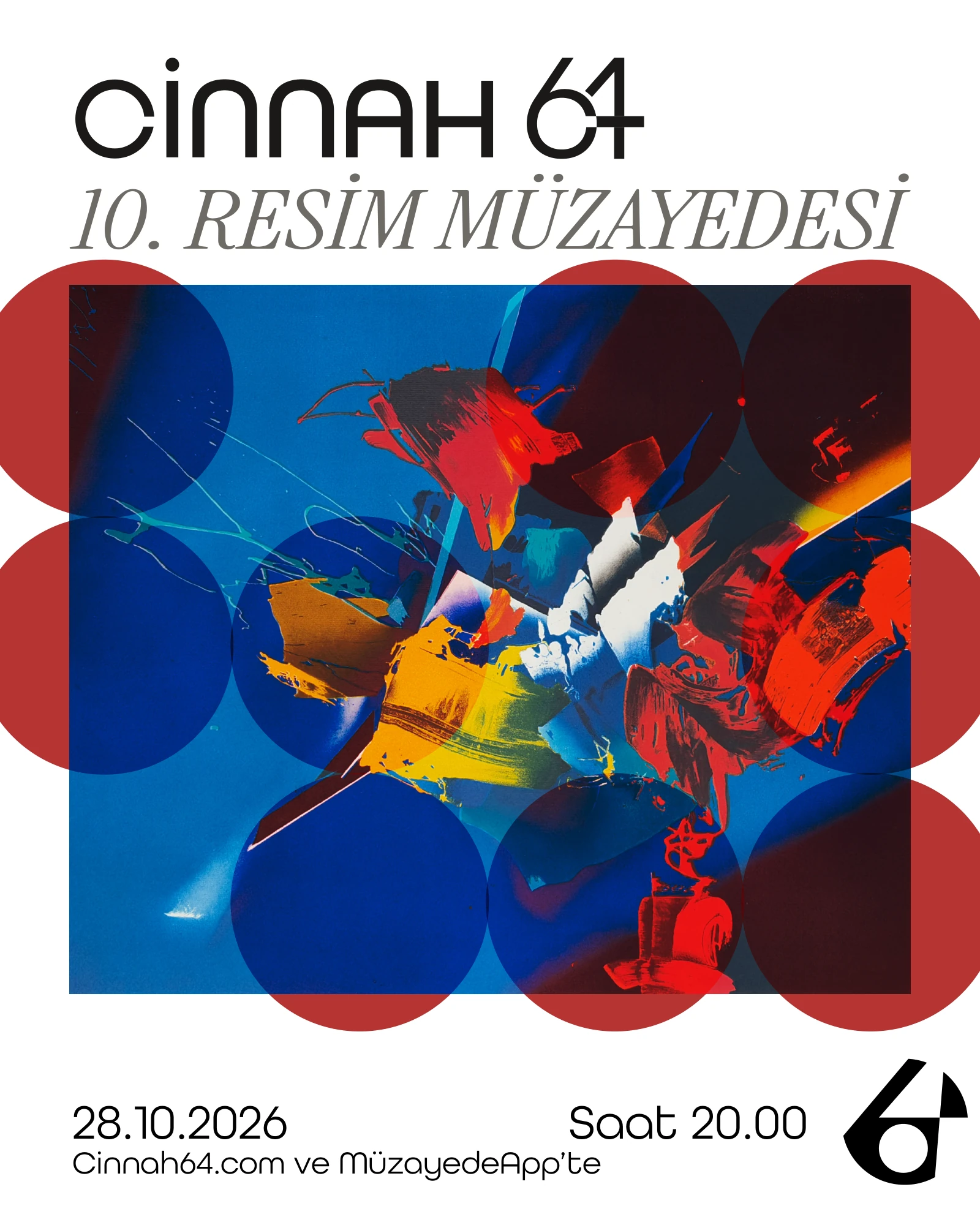
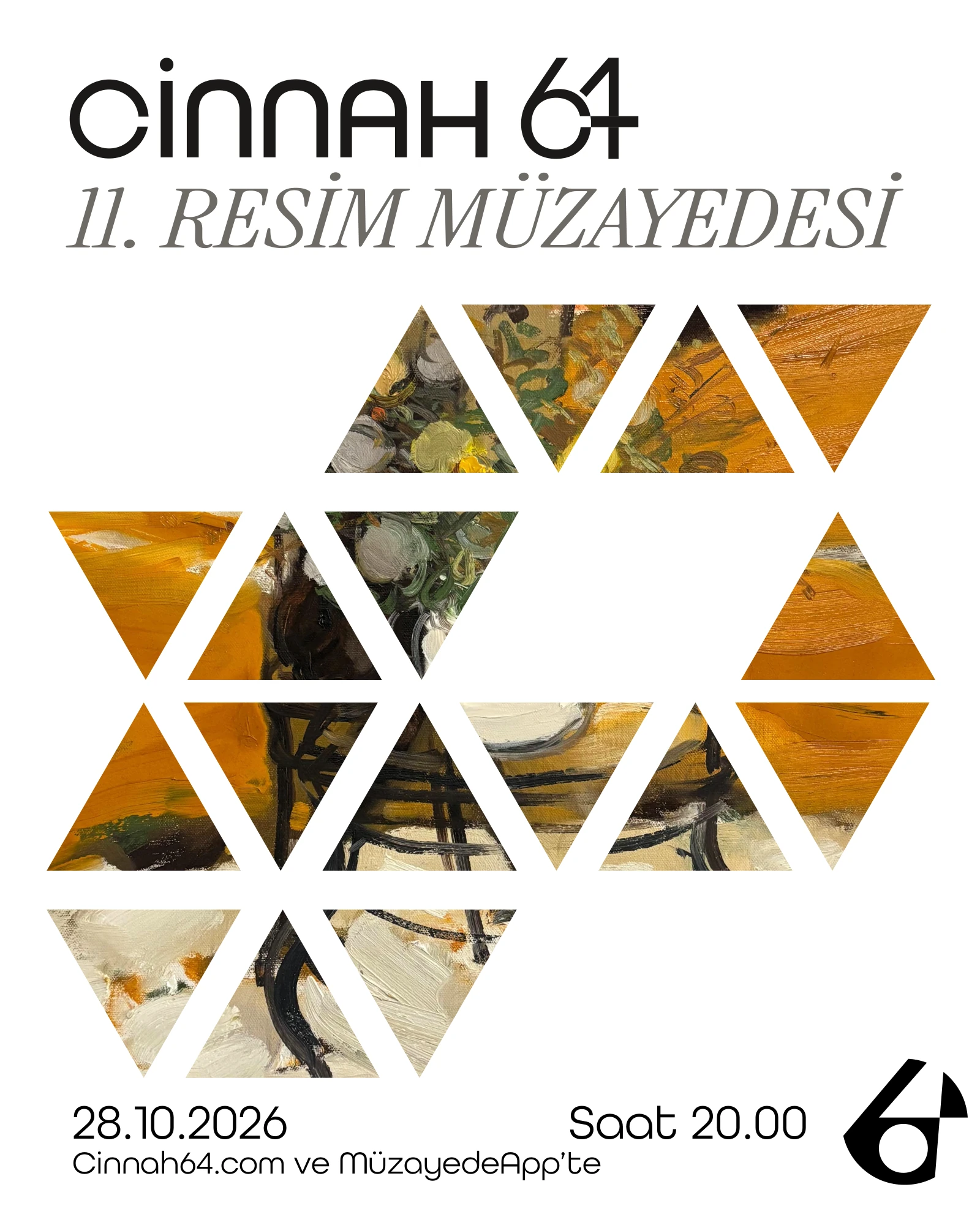
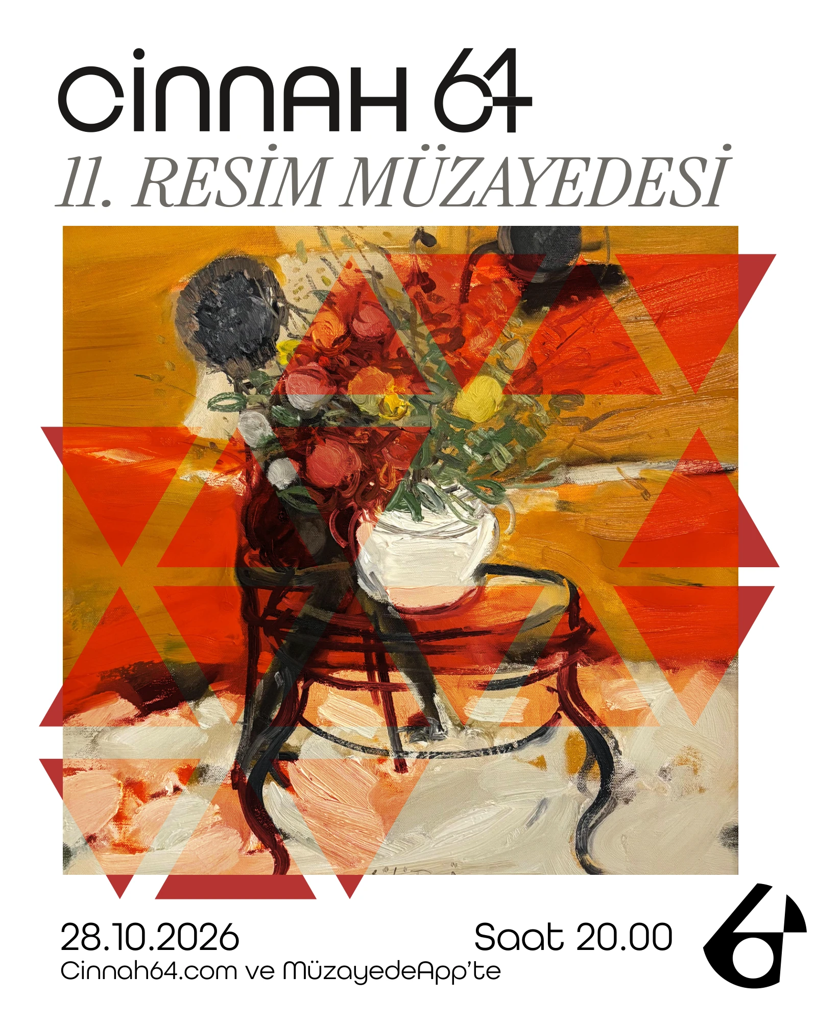
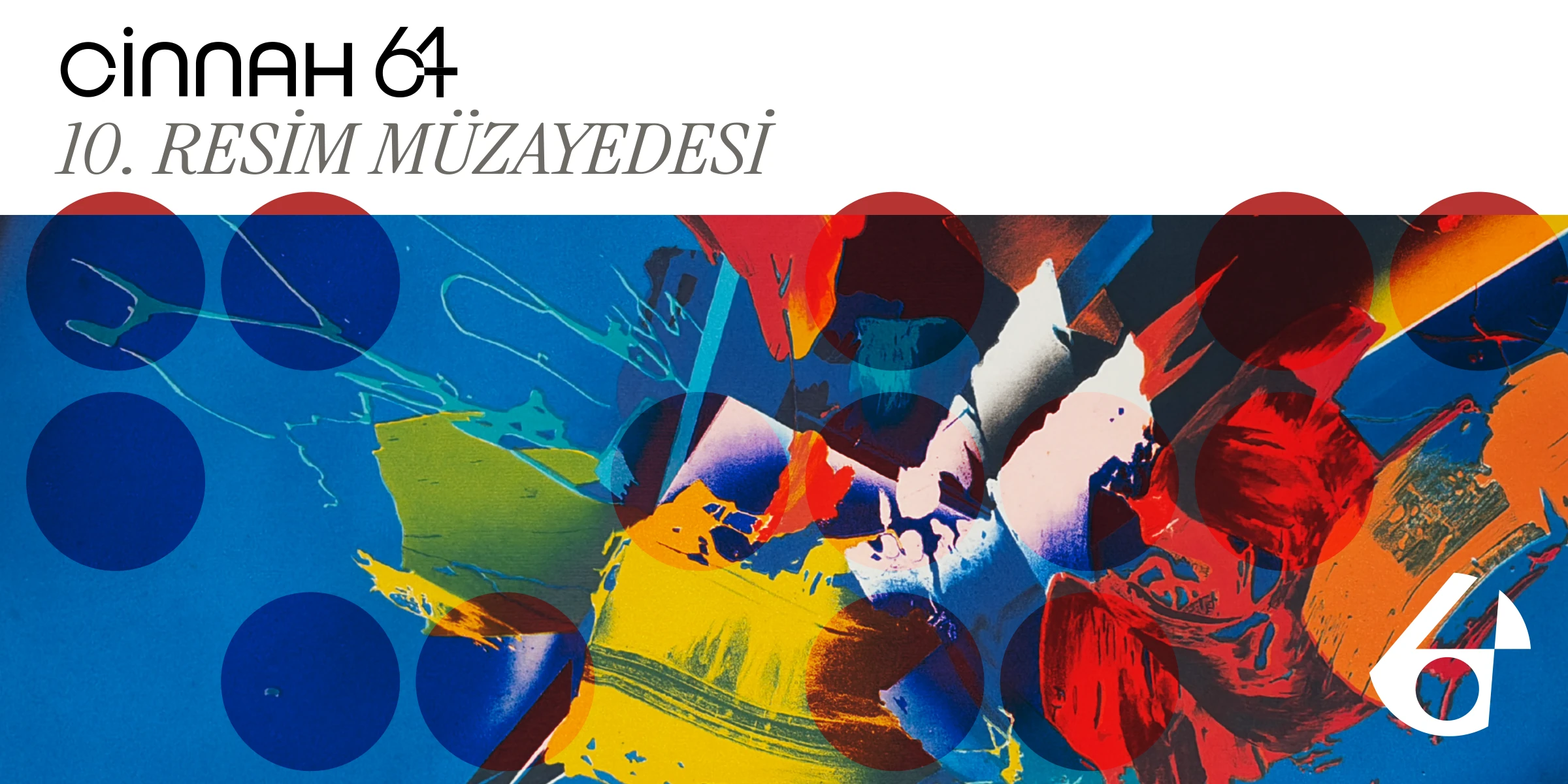
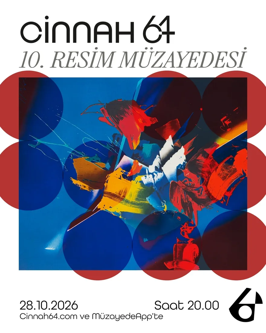
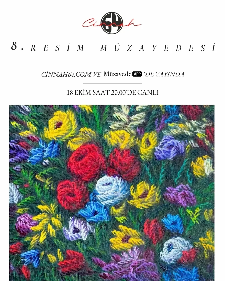 No. 8, first identityNo. 10, 2026
Online Auction Components
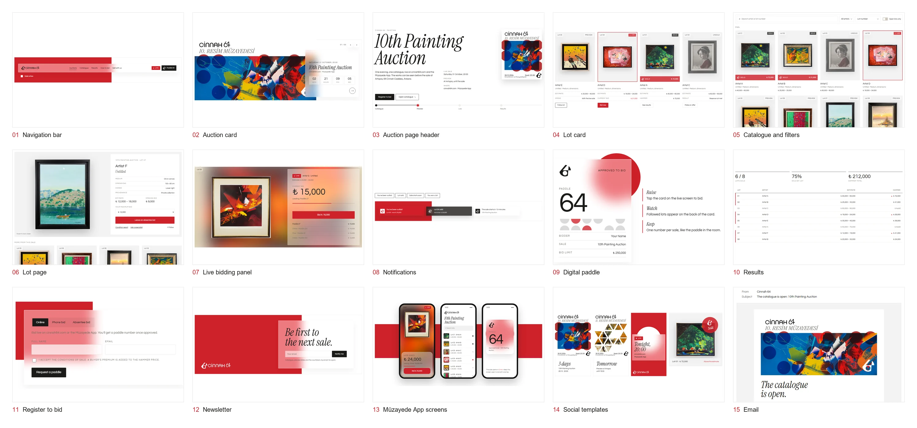
The live platform is not mine to change, so I designed the interface it would need in the new identity and built it in code, in a minimal language of white ground and frosted glass over the house red. The starting point is the Artopia website: its floating navigation, exhibition card, artwork card and search become an auction card with a countdown, a lot card with four states and a filterable catalogue. New components cover what only an auction has: a lot page, a live bidding panel, notifications, a digital paddle, results, registration, app screens, social templates and email.
The panel below runs on simulated bids. You are paddle 64: bid against the room and wait for the hammer.
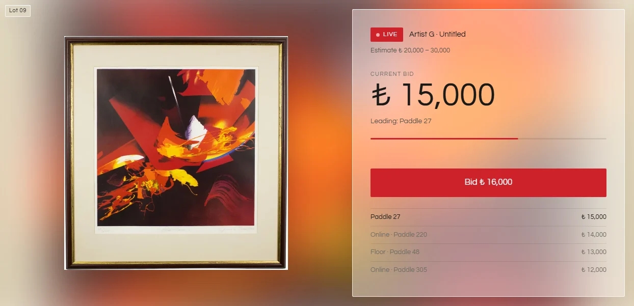 Try it →
Fifteen components, each working in the browser.
Where It Started
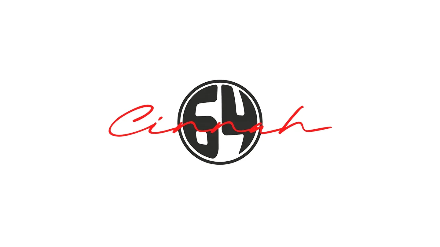
The first identity paired a handwritten red “Cinnah” with a black 64 seal. Eight auctions were run under it: the first four tried a different voice each time, from brush script to collage, typewriter and black bars; from the fifth a fixed template took over. That template proved the need for a system, and the new identity turns it into one.
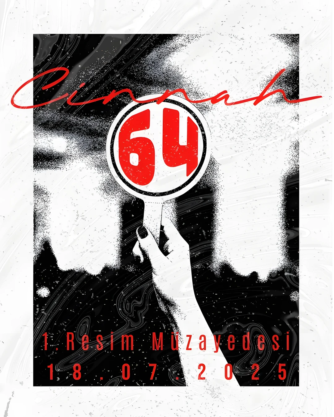
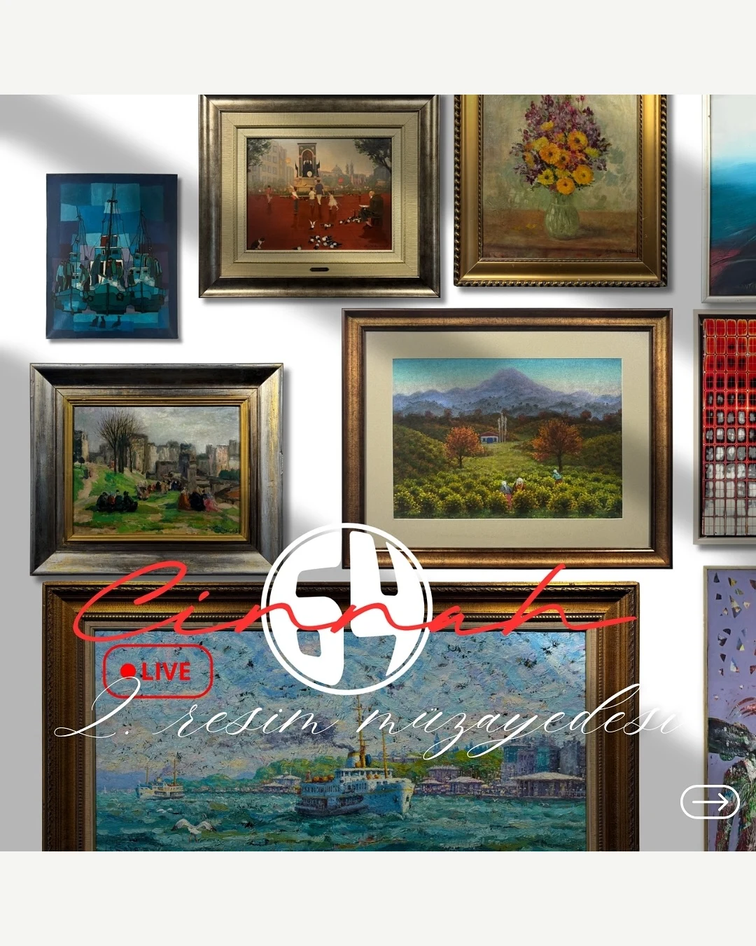
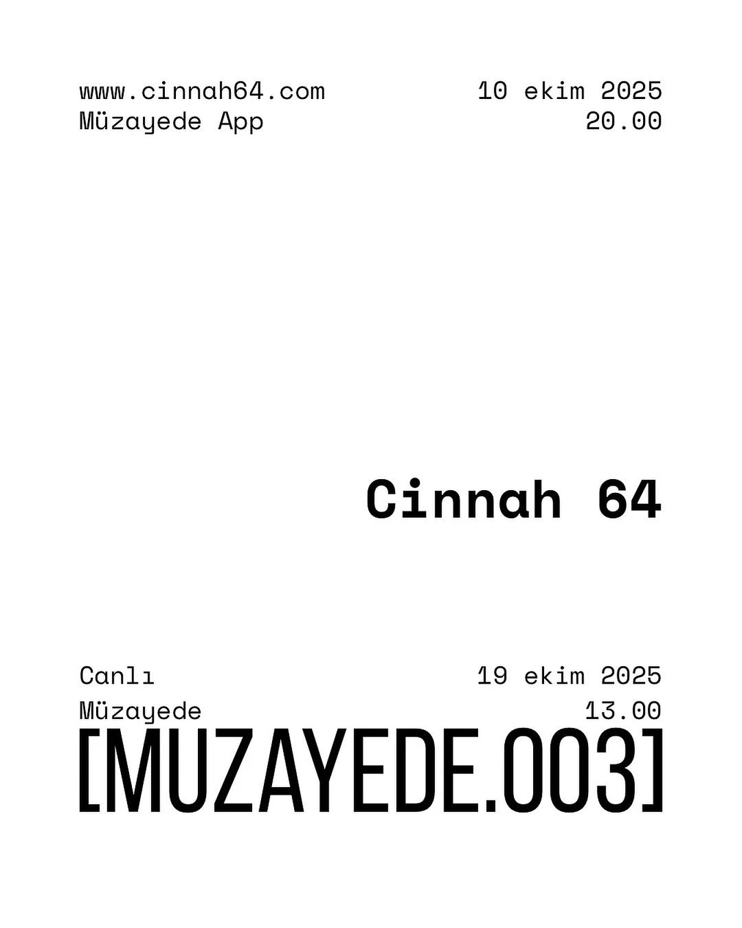
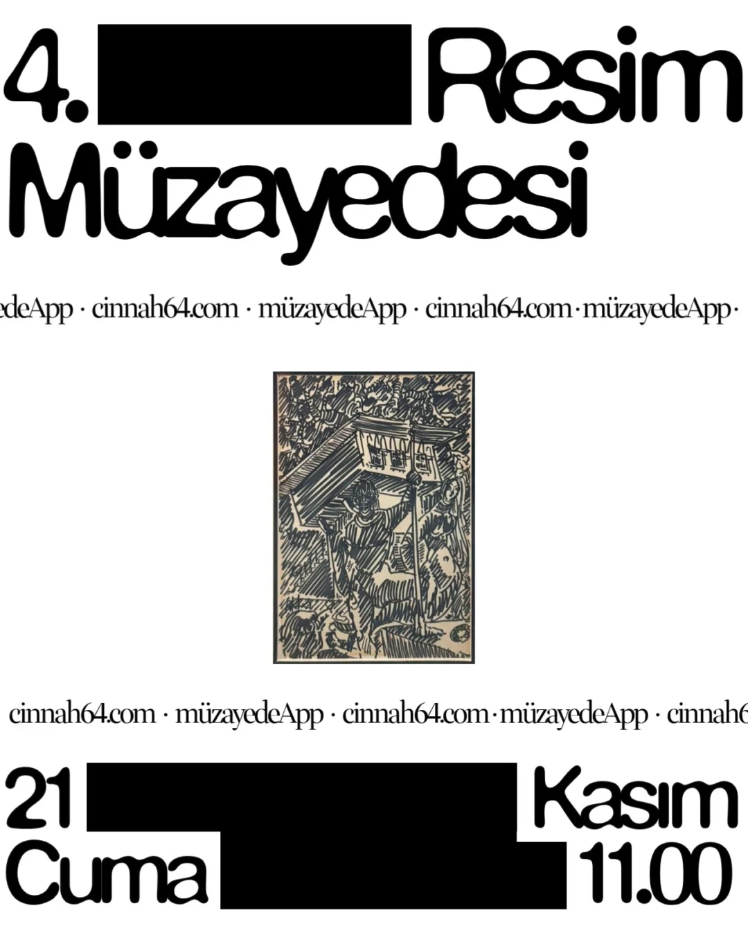
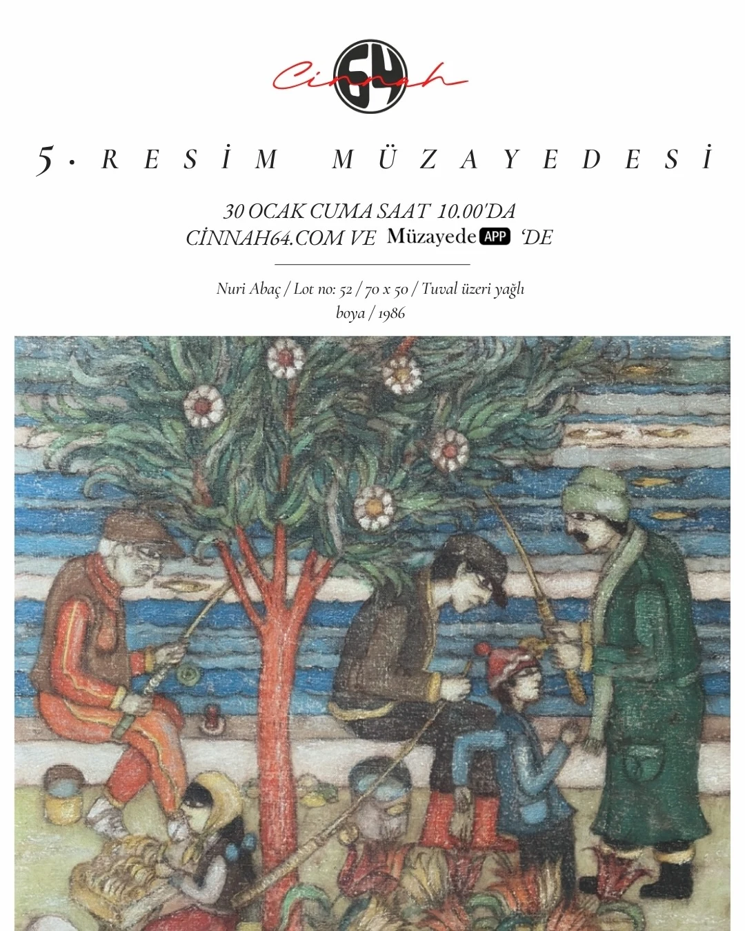
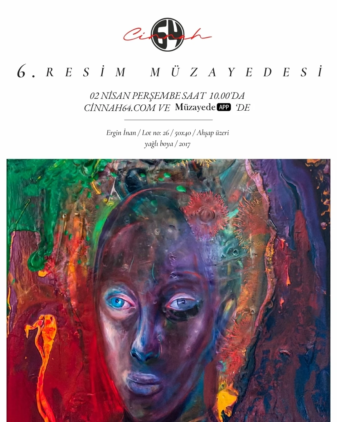
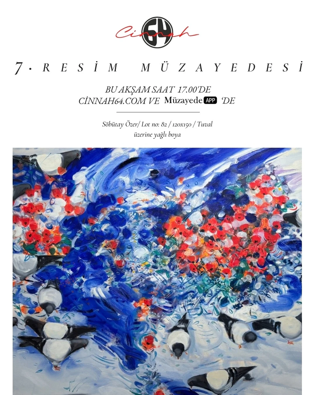
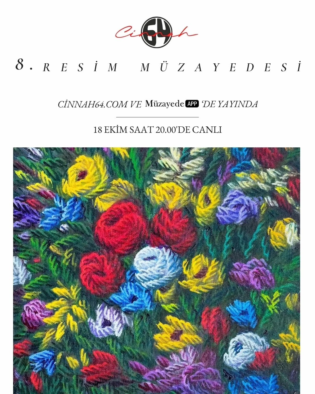
The first identity: auctions 1–8
Interested in working together?
© 2026 Deniz Yılmaz. All rights reserved.