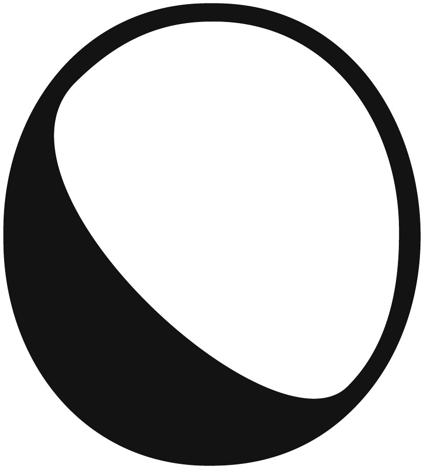
 ARTOPIA
Artopia
Where Contemporary Art Finds Space
- Year
- 2024 — Present
- Role
- Creative Designer: brand, curation, exhibitions
- Scope
- Identity, custom typeface, brand guidelines, gallery interior, posters, catalogs, signage, website
- Status
- Built and in use; pop-up at FDI 2025
- Brand built from launch
- 11 exhibitions
- Artist selection & layouts
- 0 → 4,000 Instagram followers
- 01Brief
A new contemporary art gallery in Ankara needed an identity from day one: one that could carry a changing programme of exhibitions without competing with the art.
- 02Idea
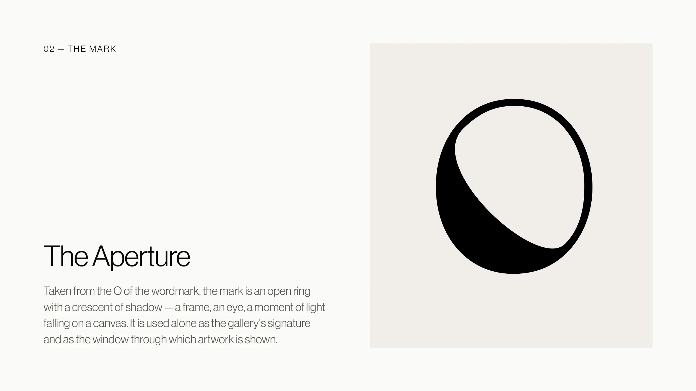
Art + topia, a place for art: a mark drawn like an organic plan with an opening in it, which is also the O of the name.
- 03System
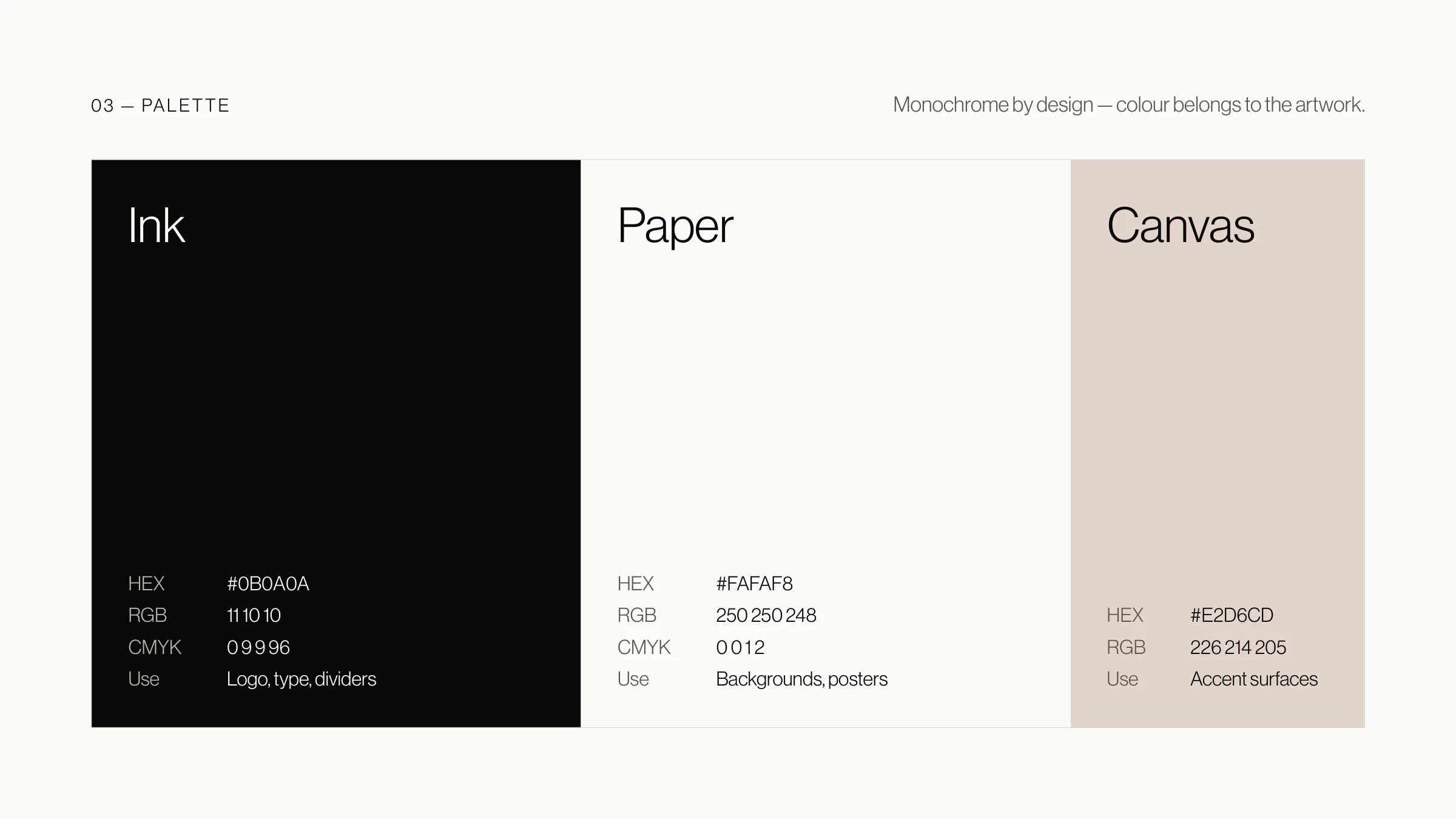
The mark, a bespoke display typeface (Artopia Sans), a monochrome palette and one layout grid, used across print, signage, web and the gallery itself. The exhibition posters stay outside it: each one is designed around its artist and their work.
- 04Result
Eleven exhibitions since December 2024, and an audience grown from zero to 4,000 Instagram followers.
Artopia is a contemporary art gallery in Ankara with a changing programme of artists. Its identity had to be quiet and exact: something that frames each show and then steps back, so the work on the wall is always what people see first.
So I designed a system rather than a logo: one mark, one typeface and one grid that work the same way on a catalogue, a wall label, the website and the gallery’s own walls.
The Mark
The name joins art and topia, place: a place that makes room for art. The mark is drawn like an architectural plan, but in its most organic form, as if it were a natural place, with an opening made within it for art.
It stands for that opening, and for the idea that this naturalness already lives in people and in everyday life. The same mark is also the O of Artopia, so the place sits inside the name itself.
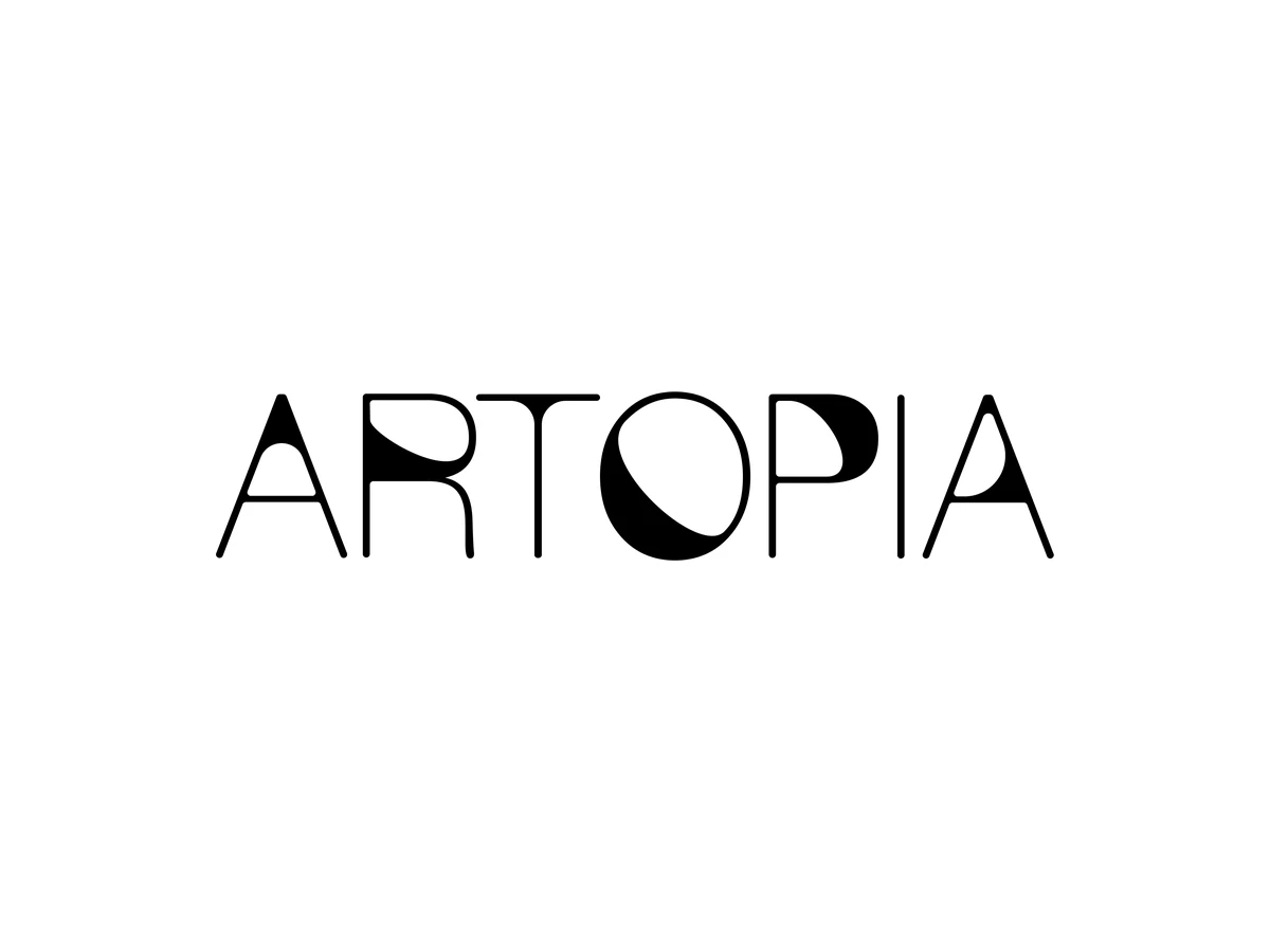
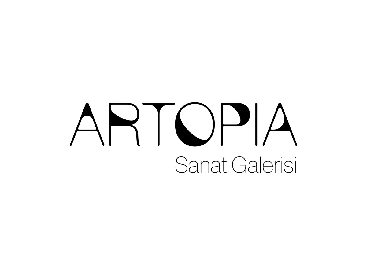
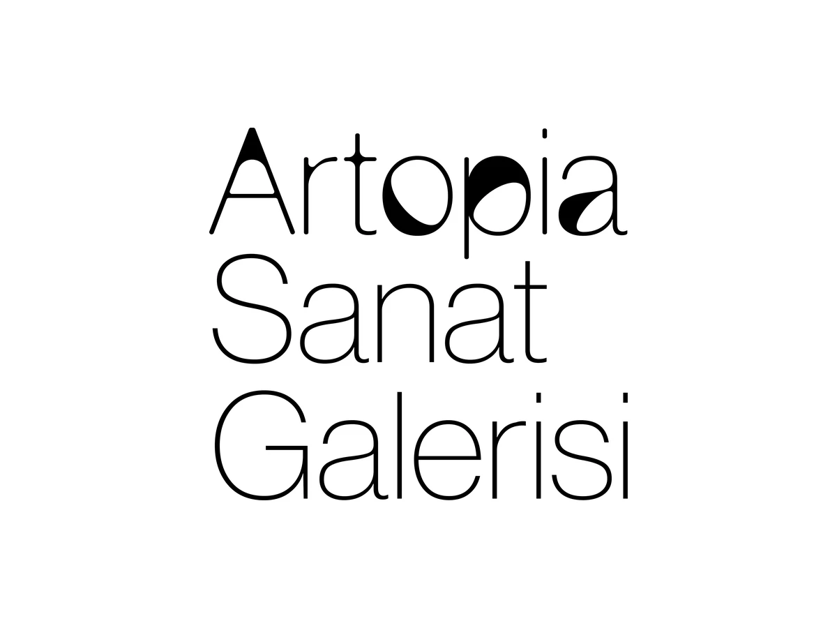
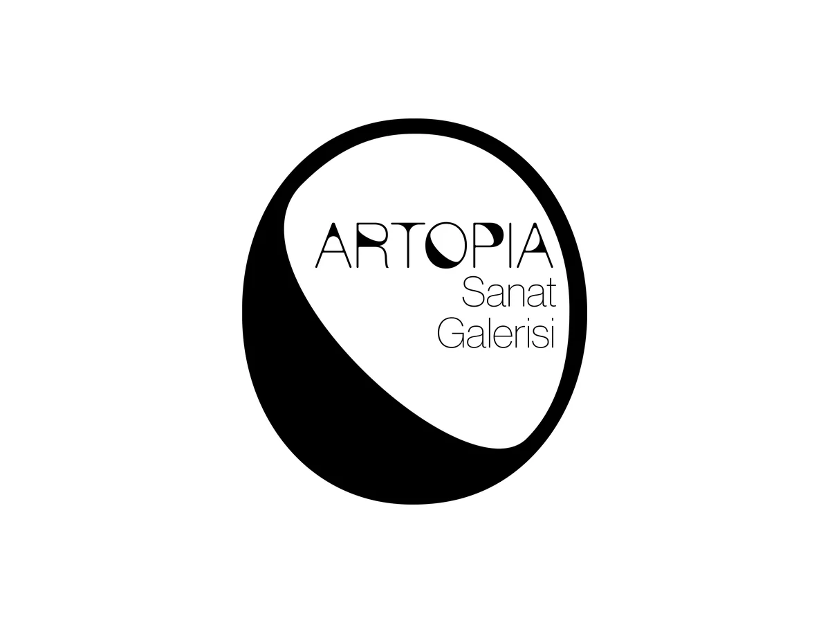

The lockups: wordmark, with Sanat Galerisi across and stacked, the seal, and the mark alone, on light and on dark
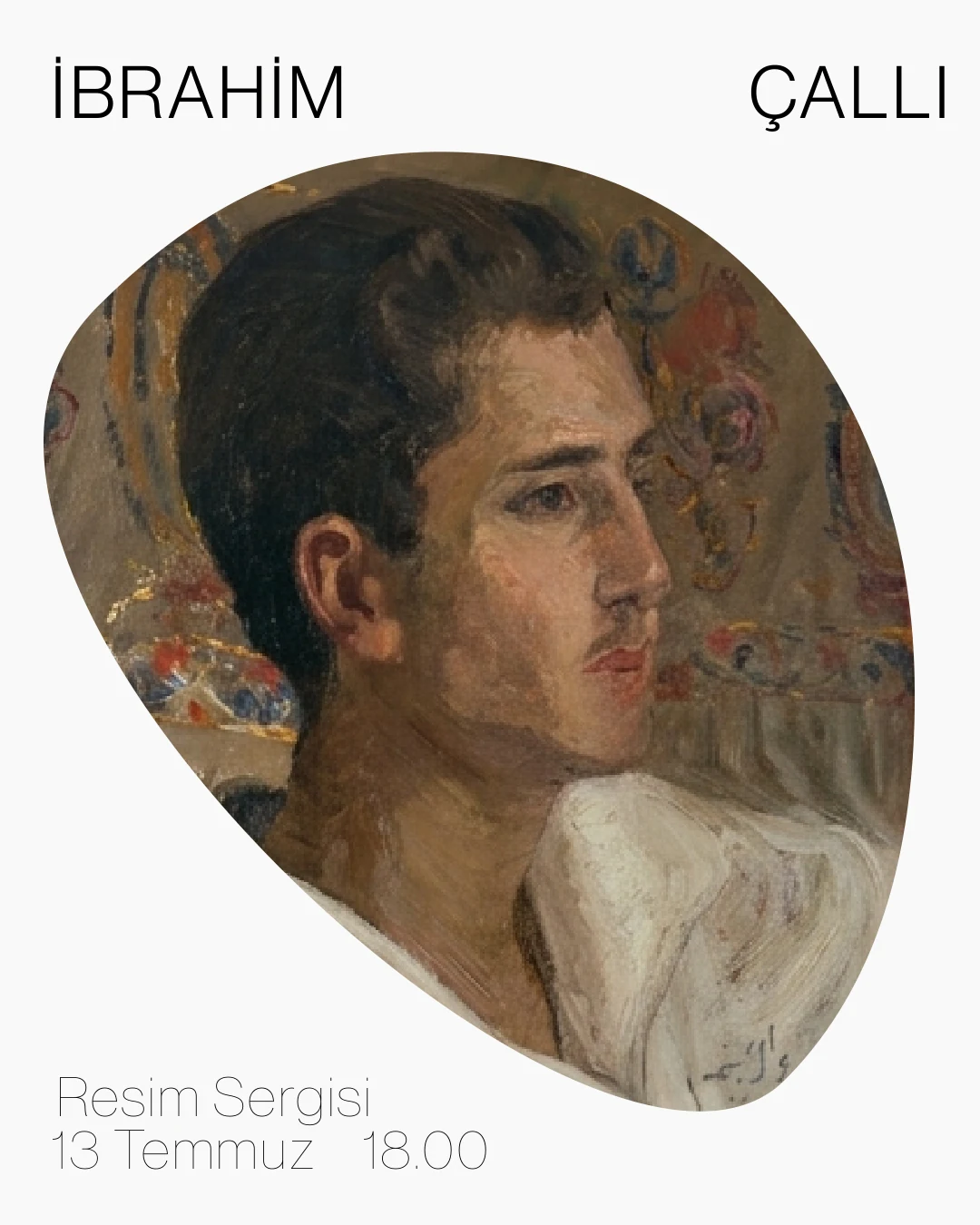
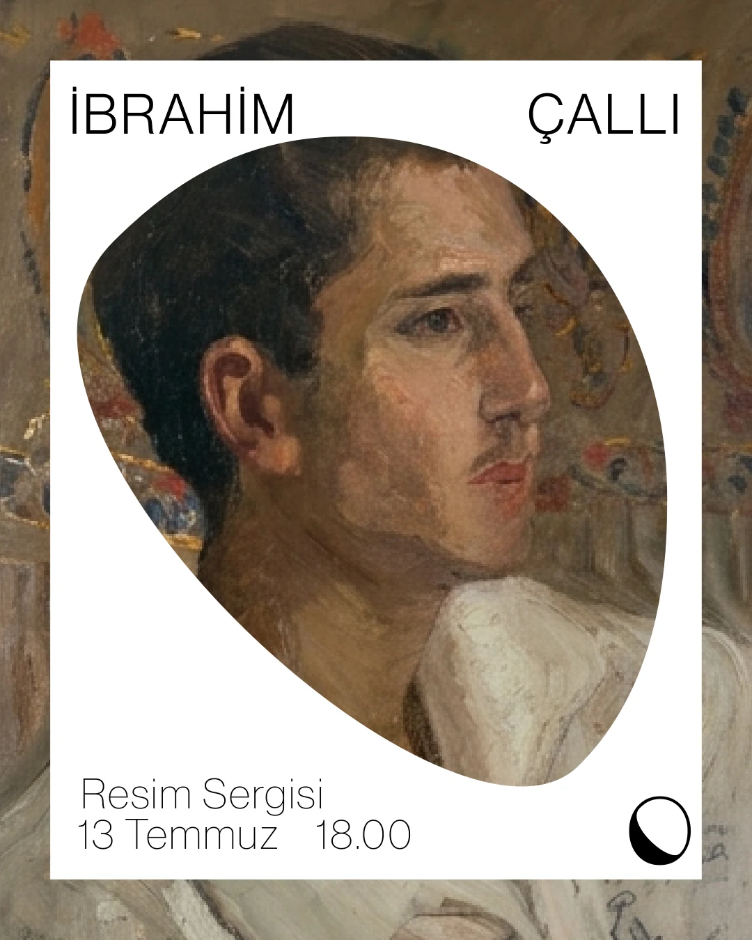
Concept explorations, not used: the opening of the mark as a frame for a painting
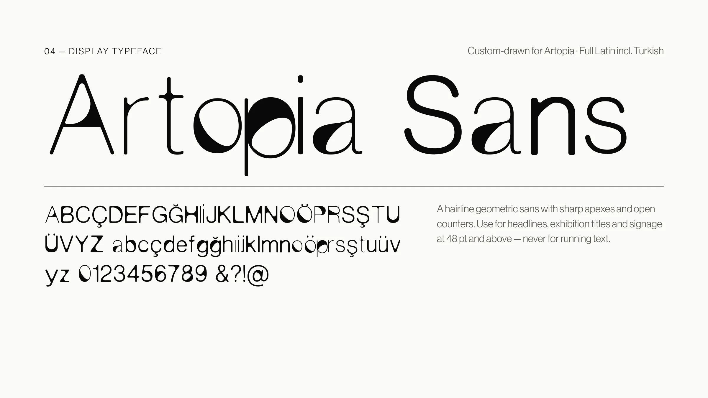
Artopia Sans
A bespoke display typeface created as the cornerstone of Artopia's identity. Built on a neo-grotesque skeleton, each letter carries a recurring sculptural cut that echoes the organic opening of the mark.
Designed for logos, exhibition titles, signage and digital campaigns, it gives the gallery a signature voice while the artwork stays at the centre. Try it below.
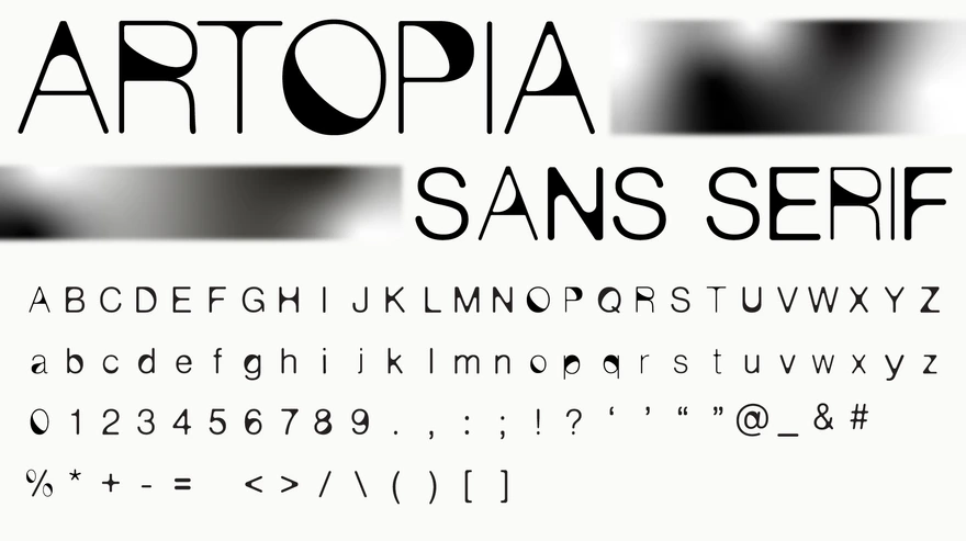
ARTOPIA SANAT GALERİSİ
The Gallery
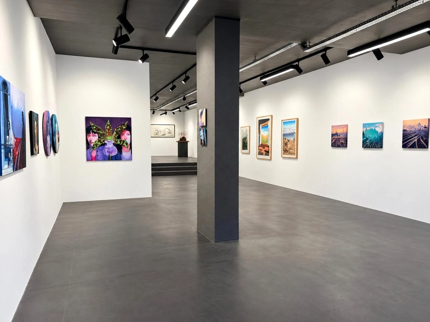
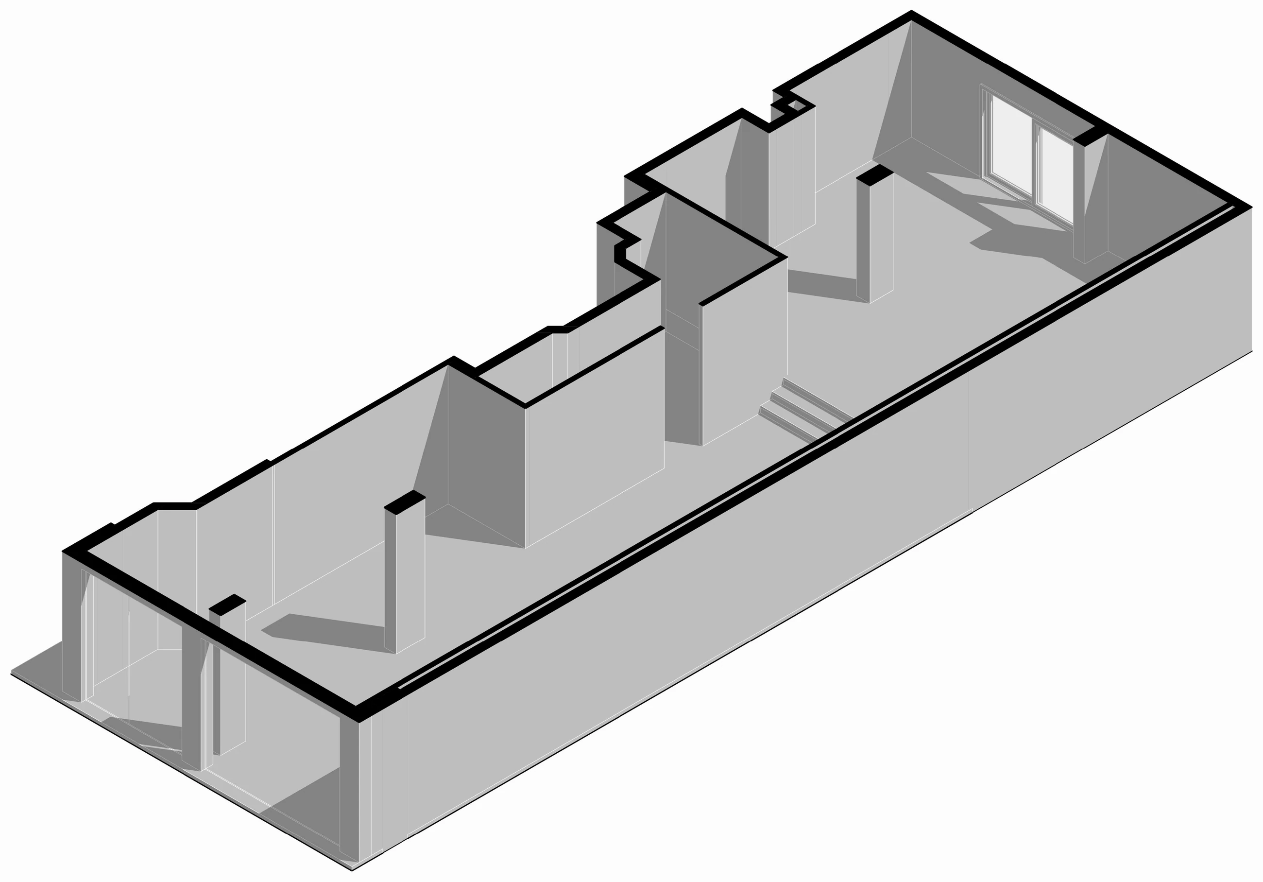
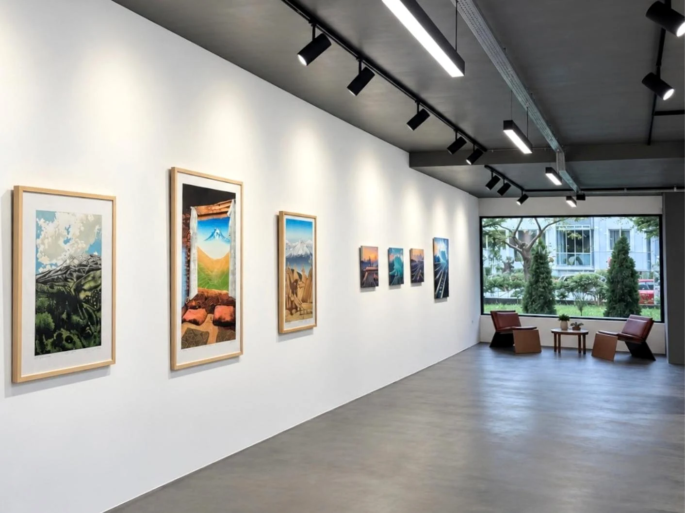
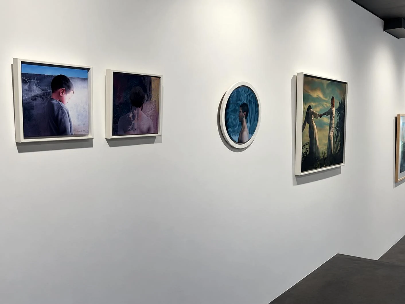
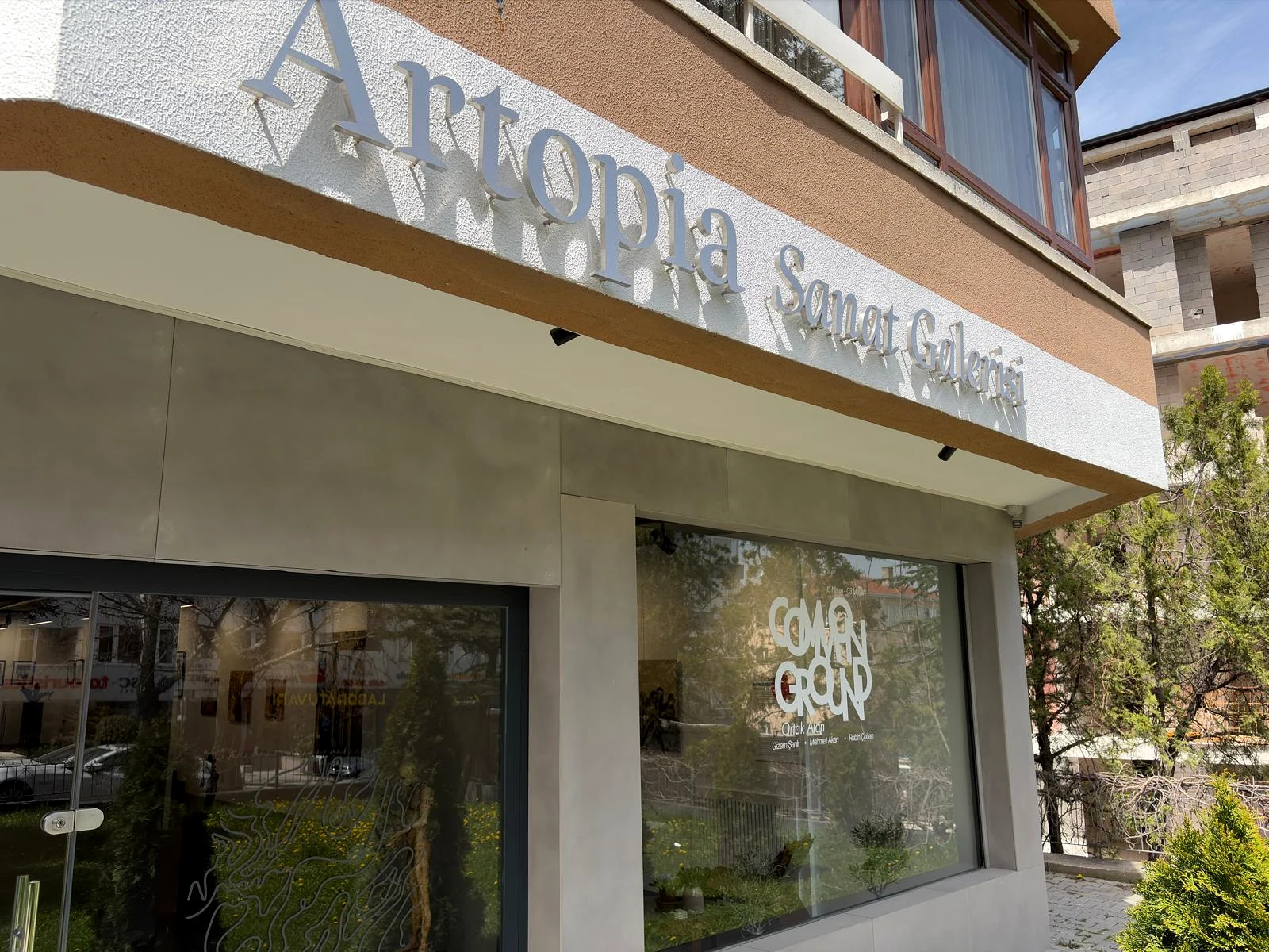
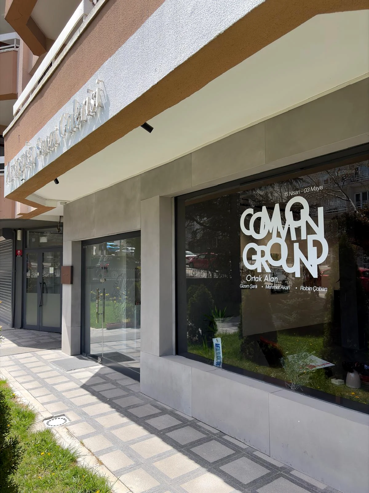
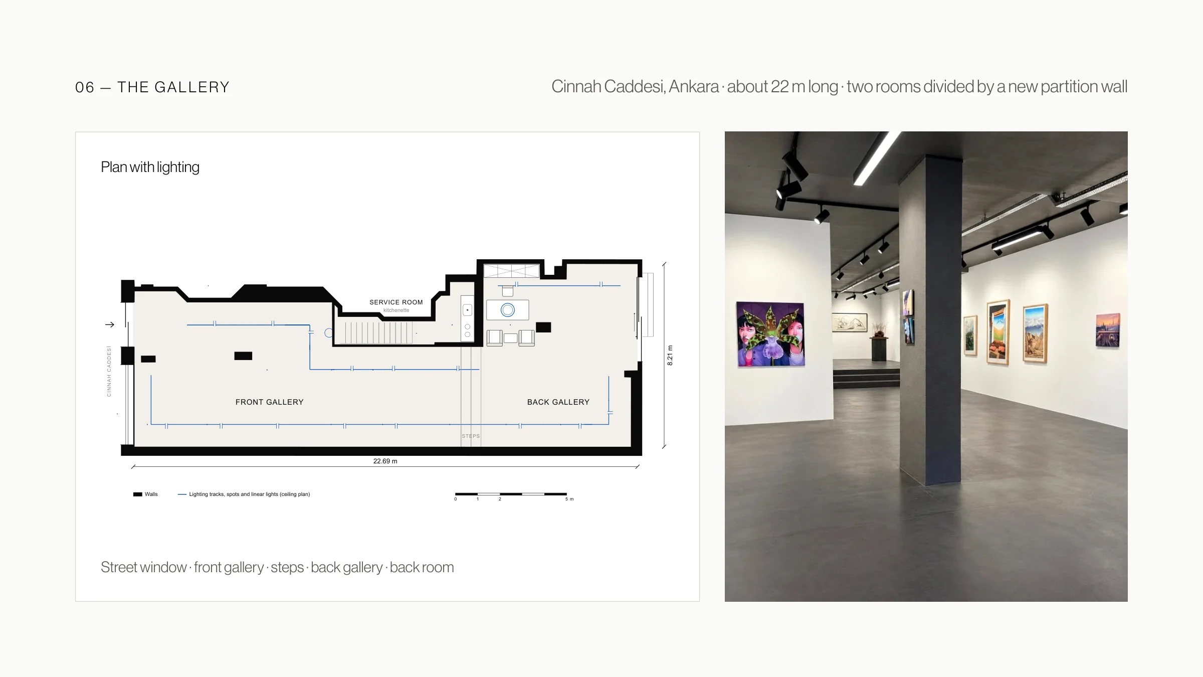
I also designed the gallery itself: a long, narrow ground-floor space of about 22 metres on Cinnah Caddesi in Ankara. A new partition wall splits it into two rooms, so a show can unfold as a sequence, and a street window at the front opens the gallery to the city.
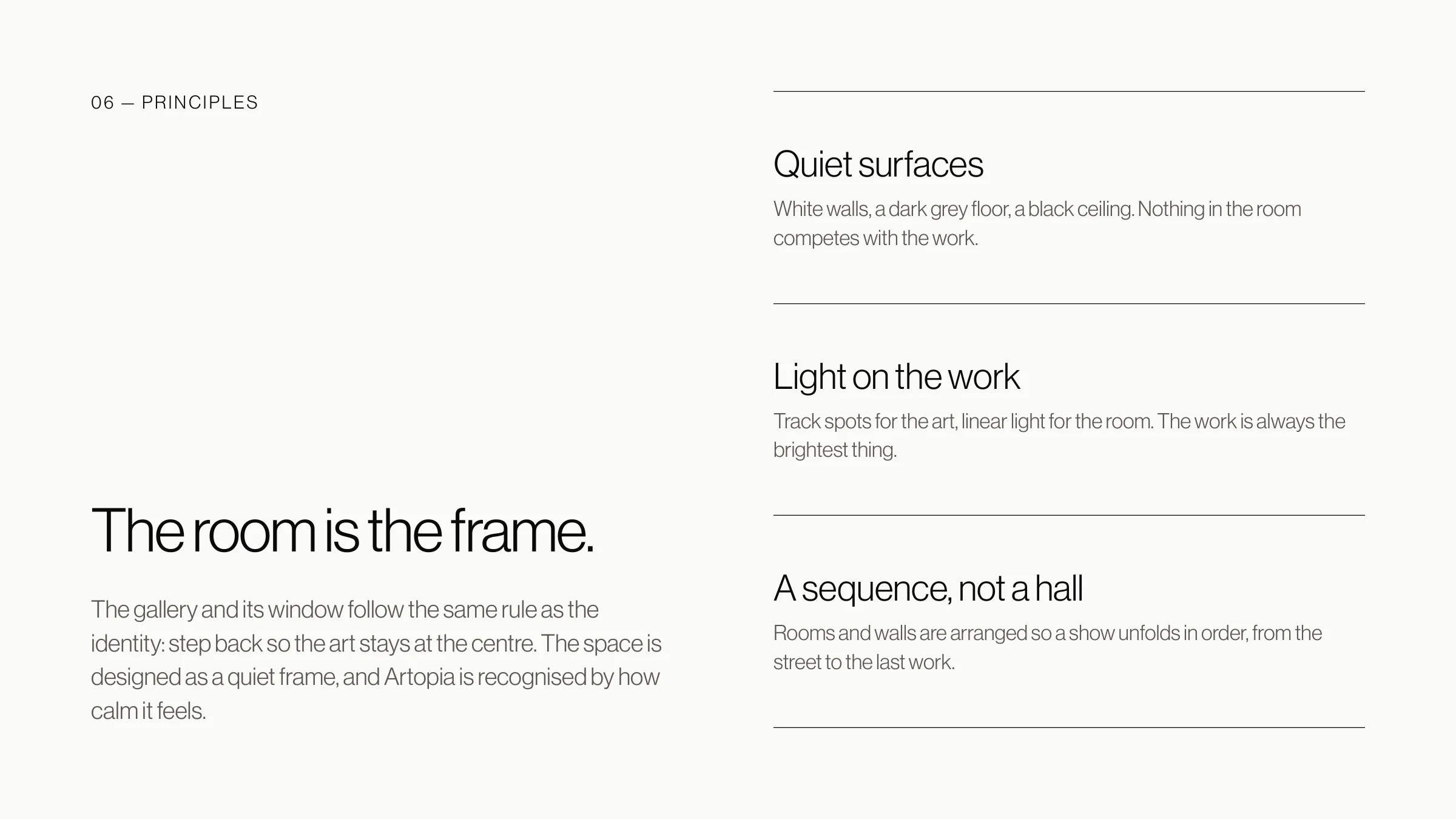
The architecture follows the same rule as the brand. White walls, a dark grey floor and a black ceiling with track spots and linear lights keep every surface quiet, so the art stays at the centre. On the facade, the name in Artopia’s letters and each exhibition on the window carry the identity to the street.

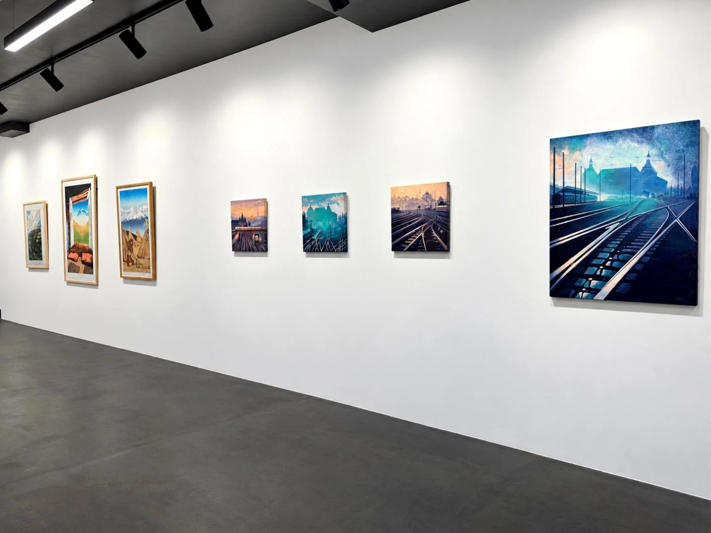
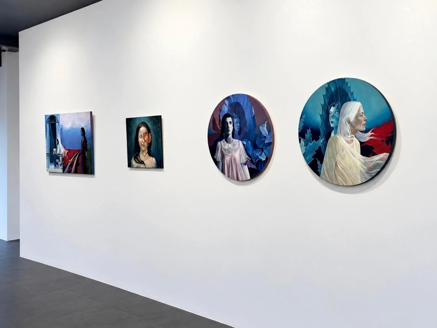
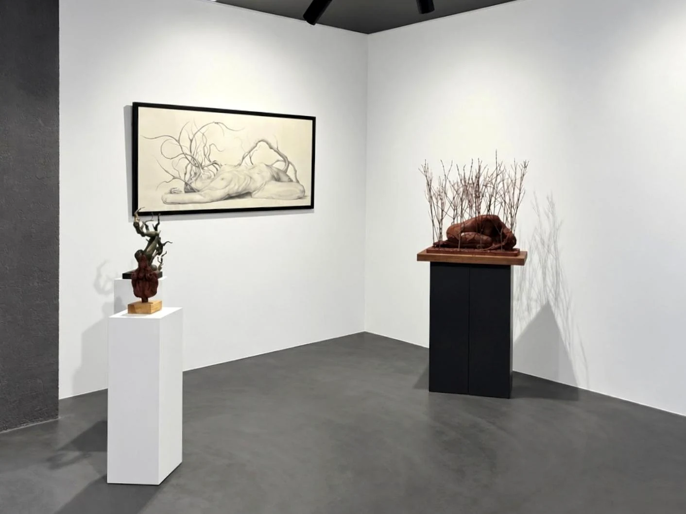
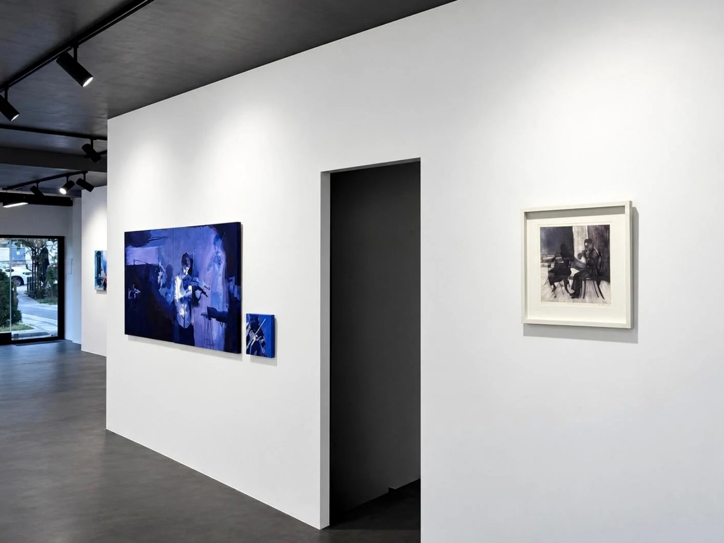
Pop-up at Furnishings & Design Istanbul
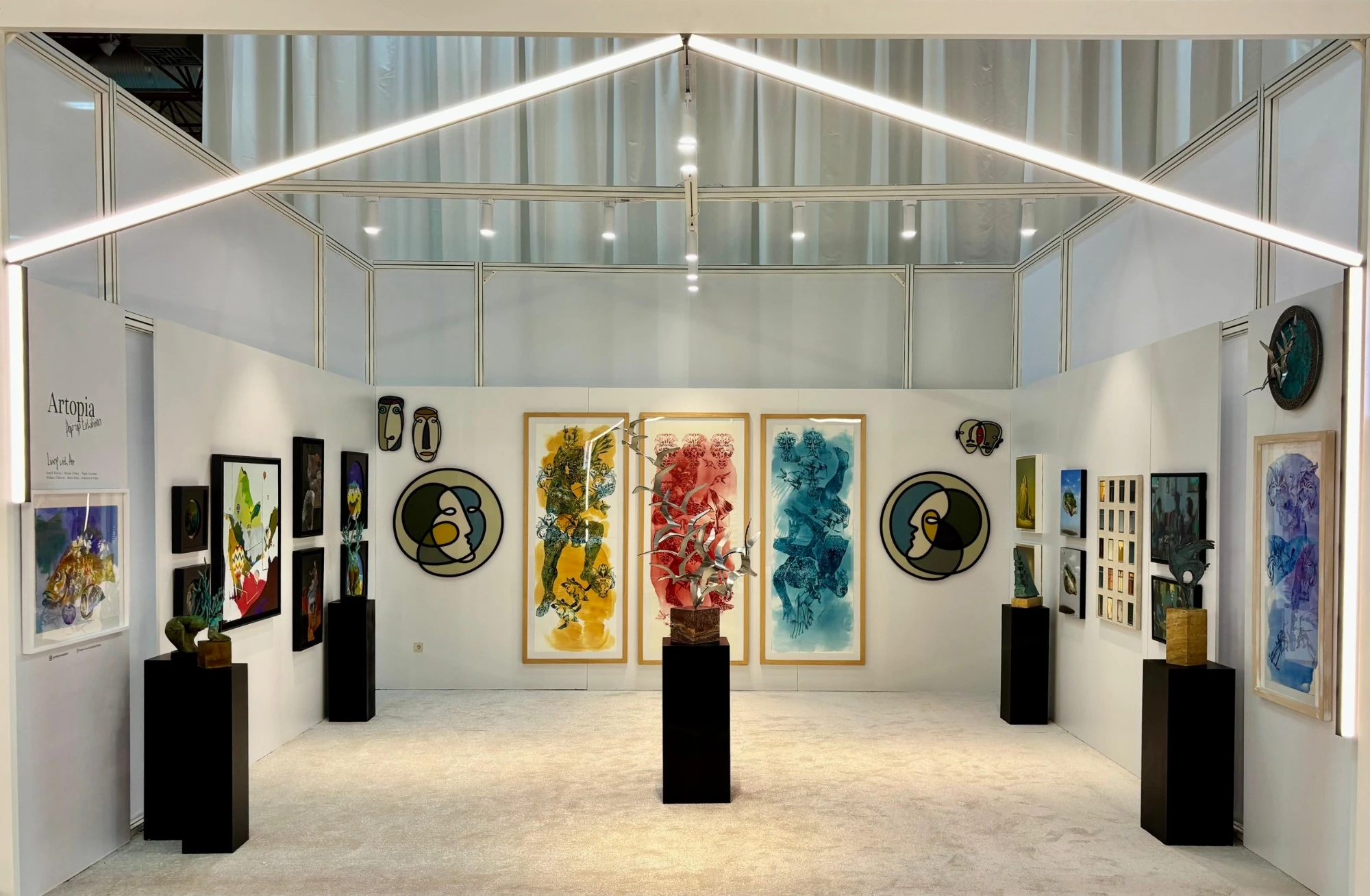
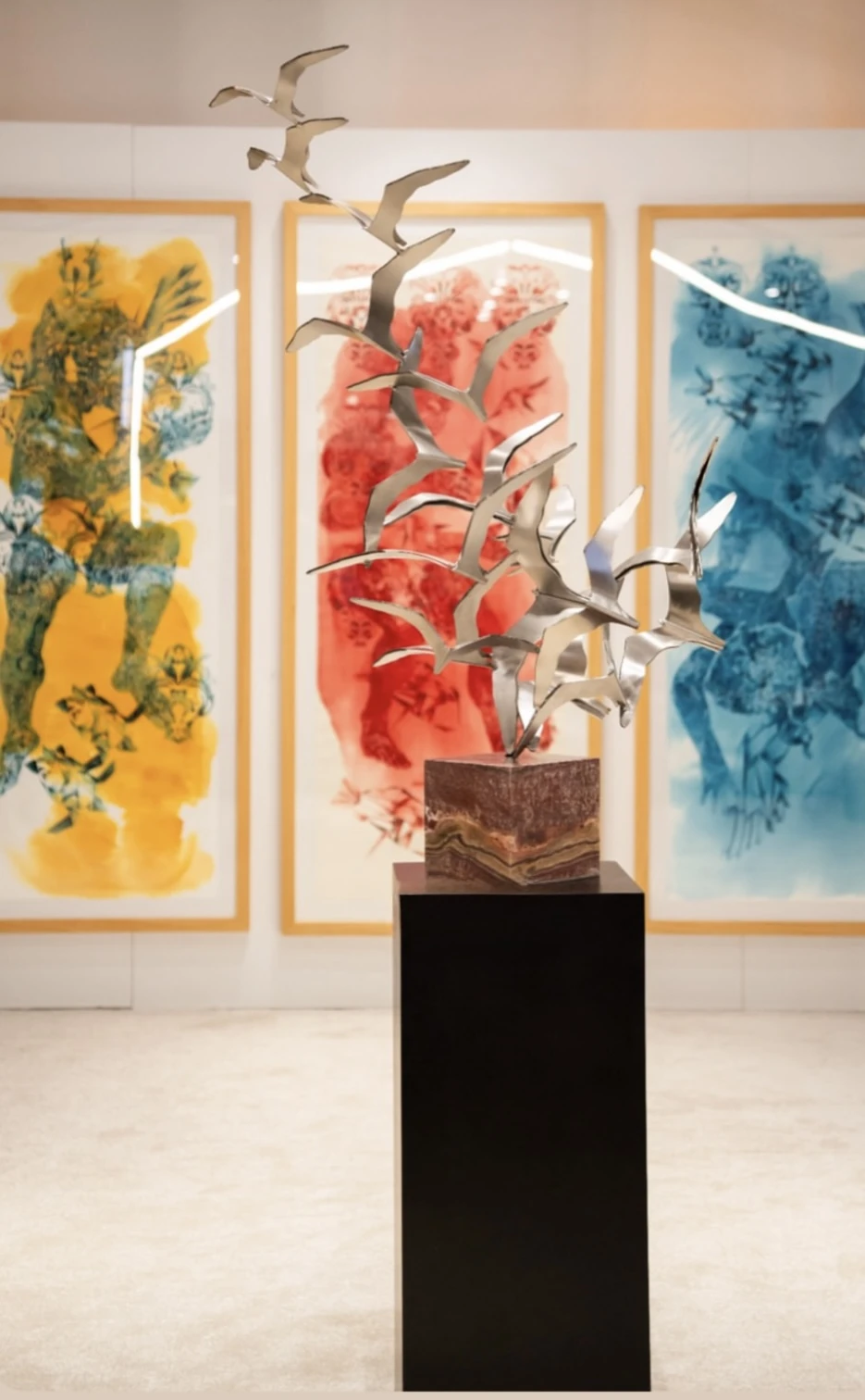
In September 2025 Artopia took the gallery to Furnishings & Design Istanbul, a furniture and interiors fair. I designed the 36 m² stand, curated the works with the gallery and designed every printed and digital piece of the show.
The exhibition, "Living with Art", asks what happens when art, furniture and space are thought of together. The stand was built as a small white house: a pitched line of light draws the roof, the side walls open toward the aisle, and the main wall frames three tall works with a sculpture on a black plinth at its centre, so the eye is led straight into the room. A handwritten title in blue, a colour kept for the pop-up alone, sits next to the gallery logotype on the poster, the brochure, the social posts and the stand wall, so the pop-up reads as Artopia from across the hall.
- 01Brief
Bring a contemporary art gallery into a furniture fair and make it read as a place to live with art, not a sales booth.
- 02Idea
A 36 m² white house drawn in light: the roof is only a line of LEDs, the art fills the walls, plinths set the rhythm.
- 03Role
Stand design, curation and layout, and the full graphic set: poster, brochure, services sheet, social media.
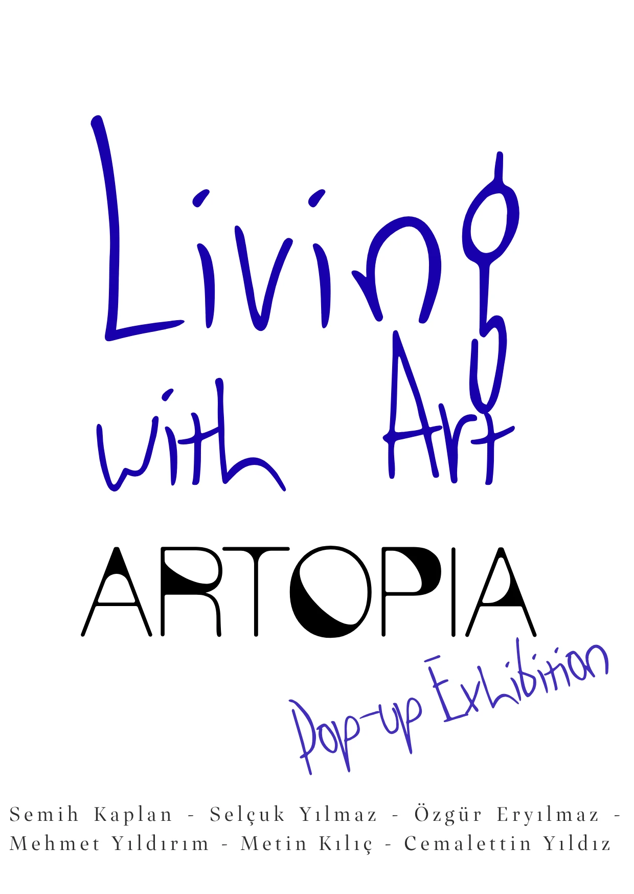
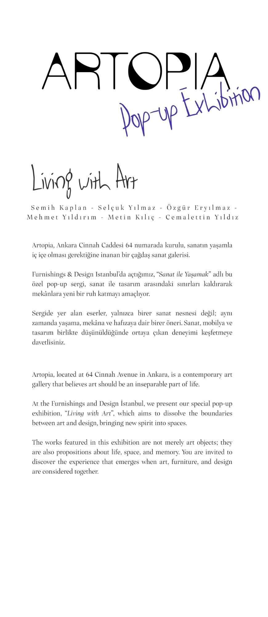
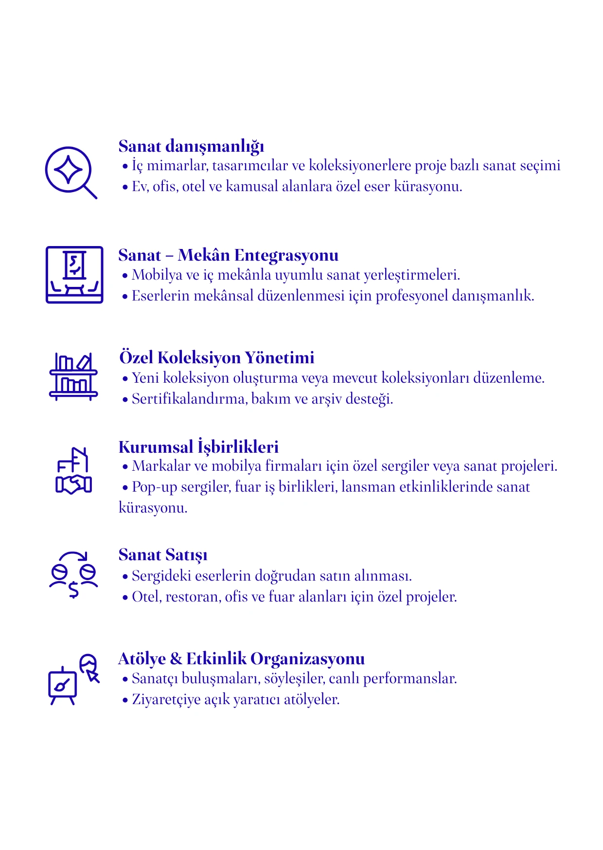
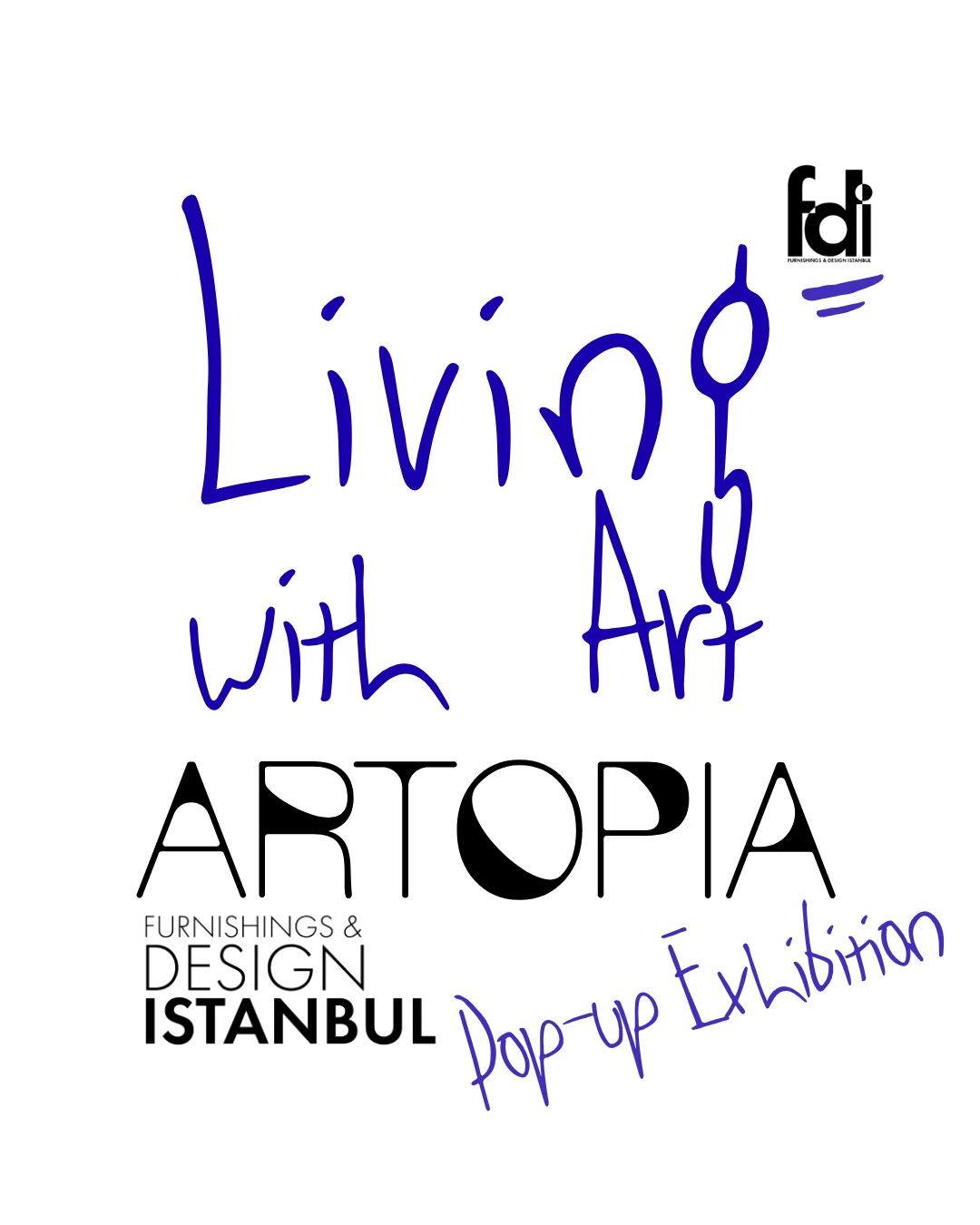
Brochure, services sheet and social post
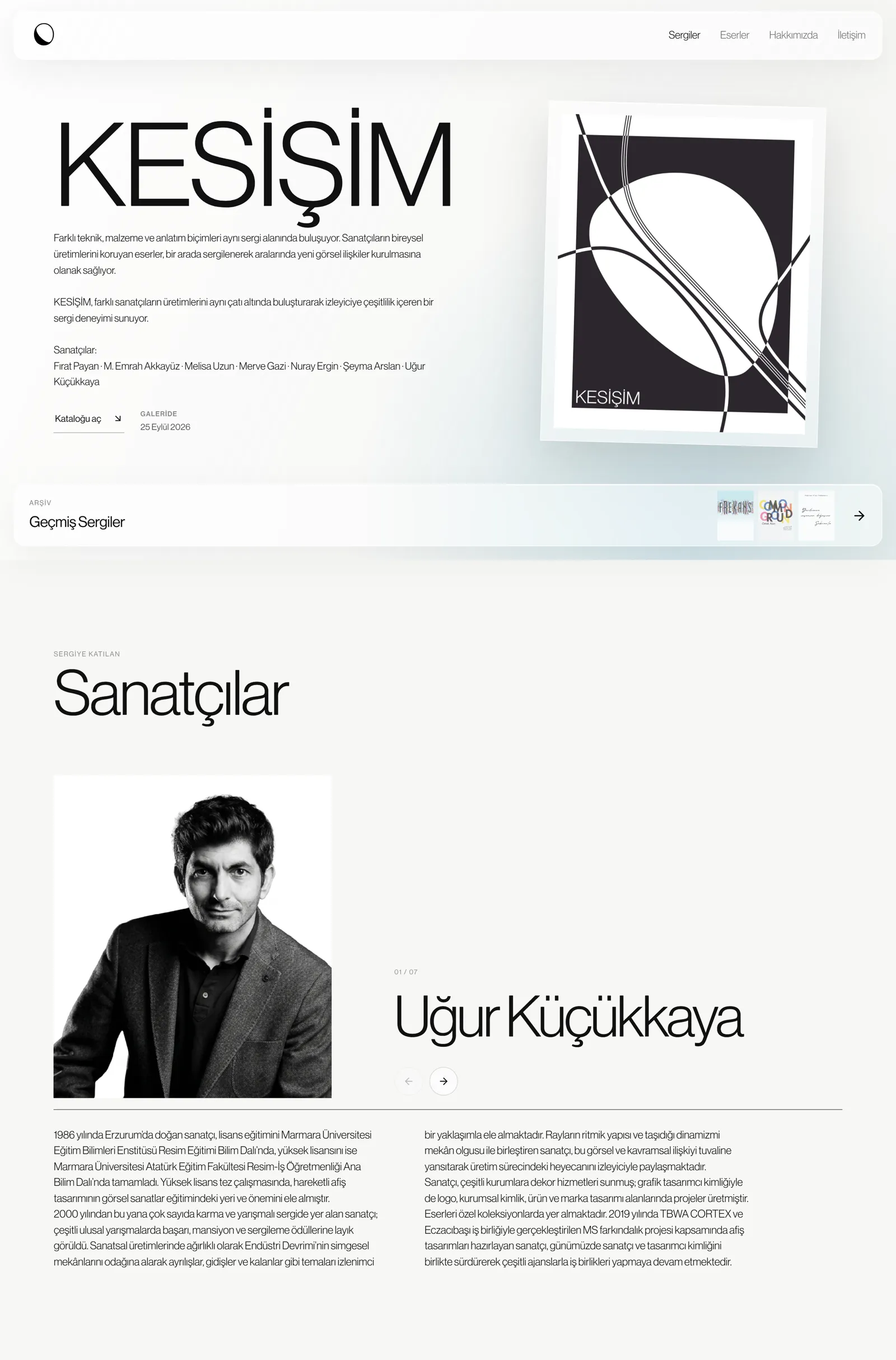
Website
The gallery's website carries the identity into the digital space: a calm interface of translucent panels, generous white space and the Artopia Sans display type, where exhibitions, artists and works always come first. Designed from desktop to mobile, it presents upcoming and past exhibitions, the collection and the gallery's story.

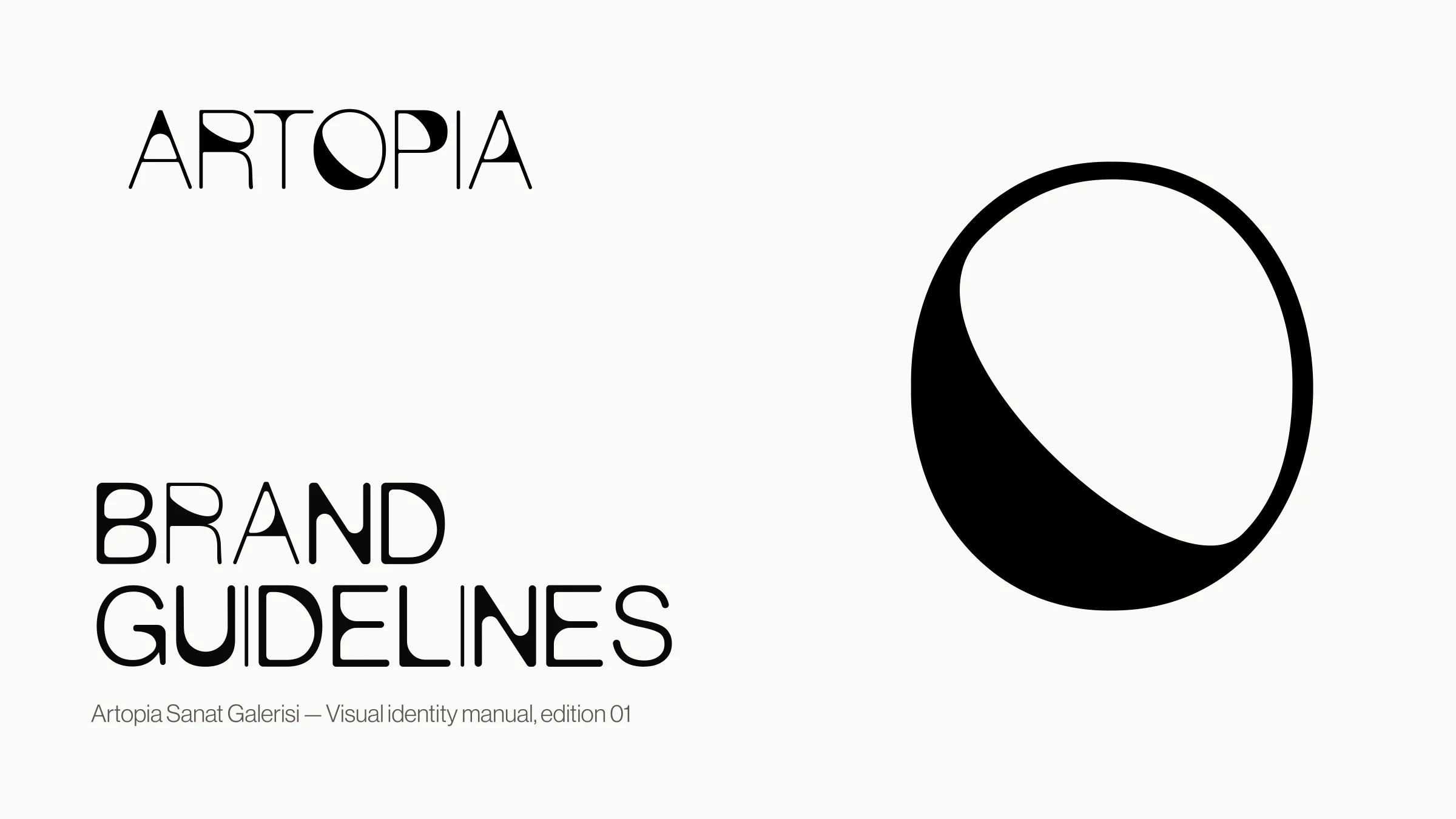
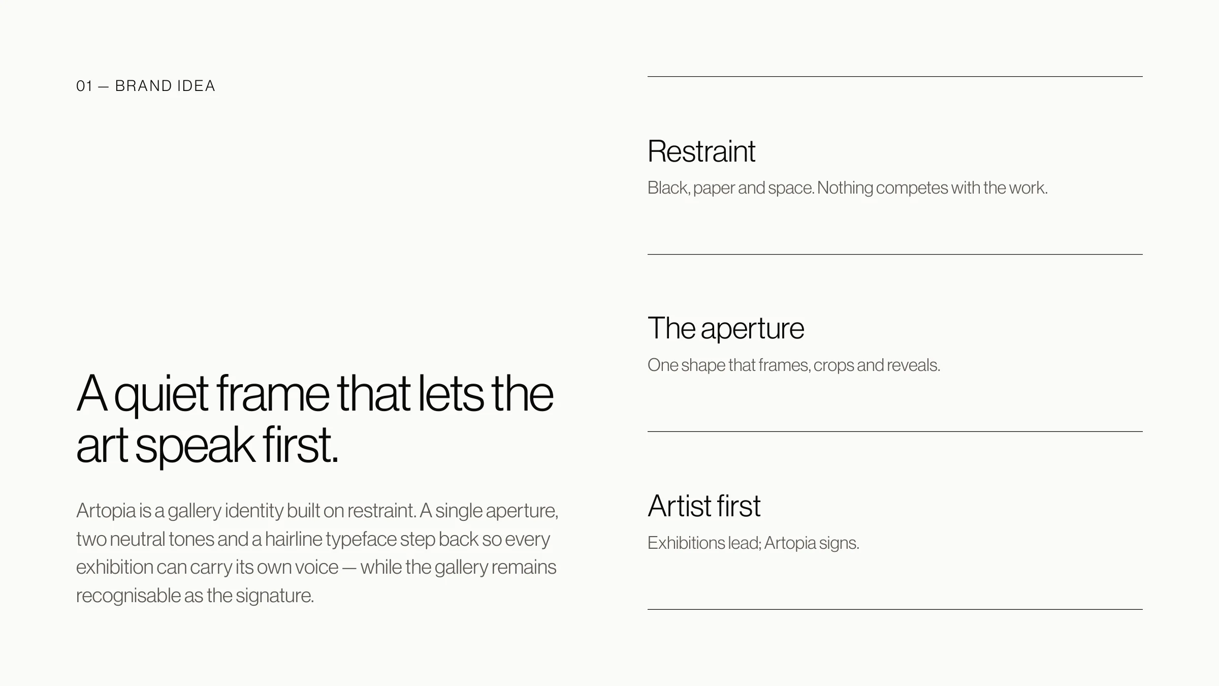
Brand Guidelines
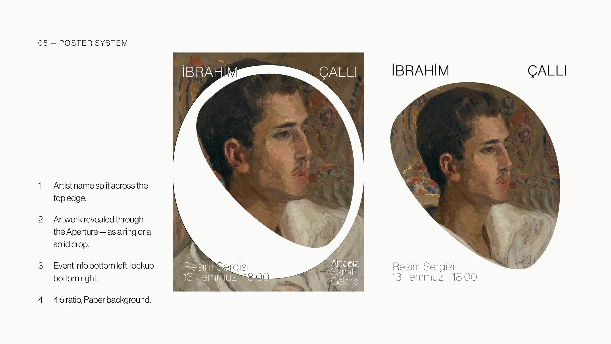
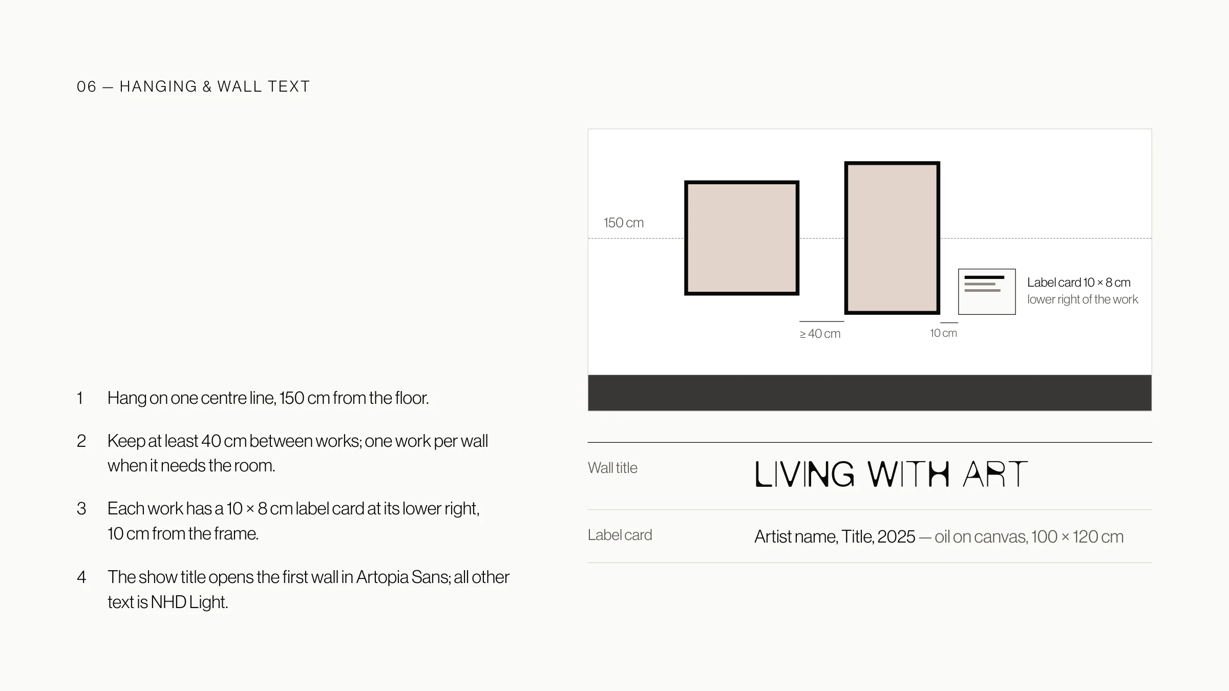
A 29-page manual that sets the rules for the mark, the palette, type and the gallery space, and proposes a frame for exhibition posters. Its last chapter carries the identity into the room: the principles of the space, the plan with its lighting, and how works and label cards are hung.
Download brand guidelinesPDF · 29 pages · 2.6 MB
Exhibition Posters
Every exhibition at Artopia tells its own story, so the posters follow no template. Each one is a concept drawn from the artist and the work on show, from a handwritten line to a map of the city.
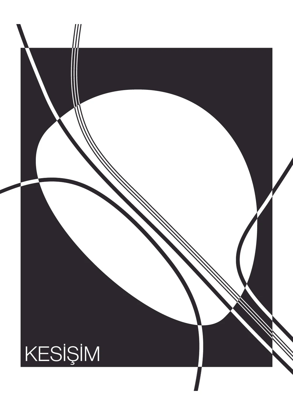
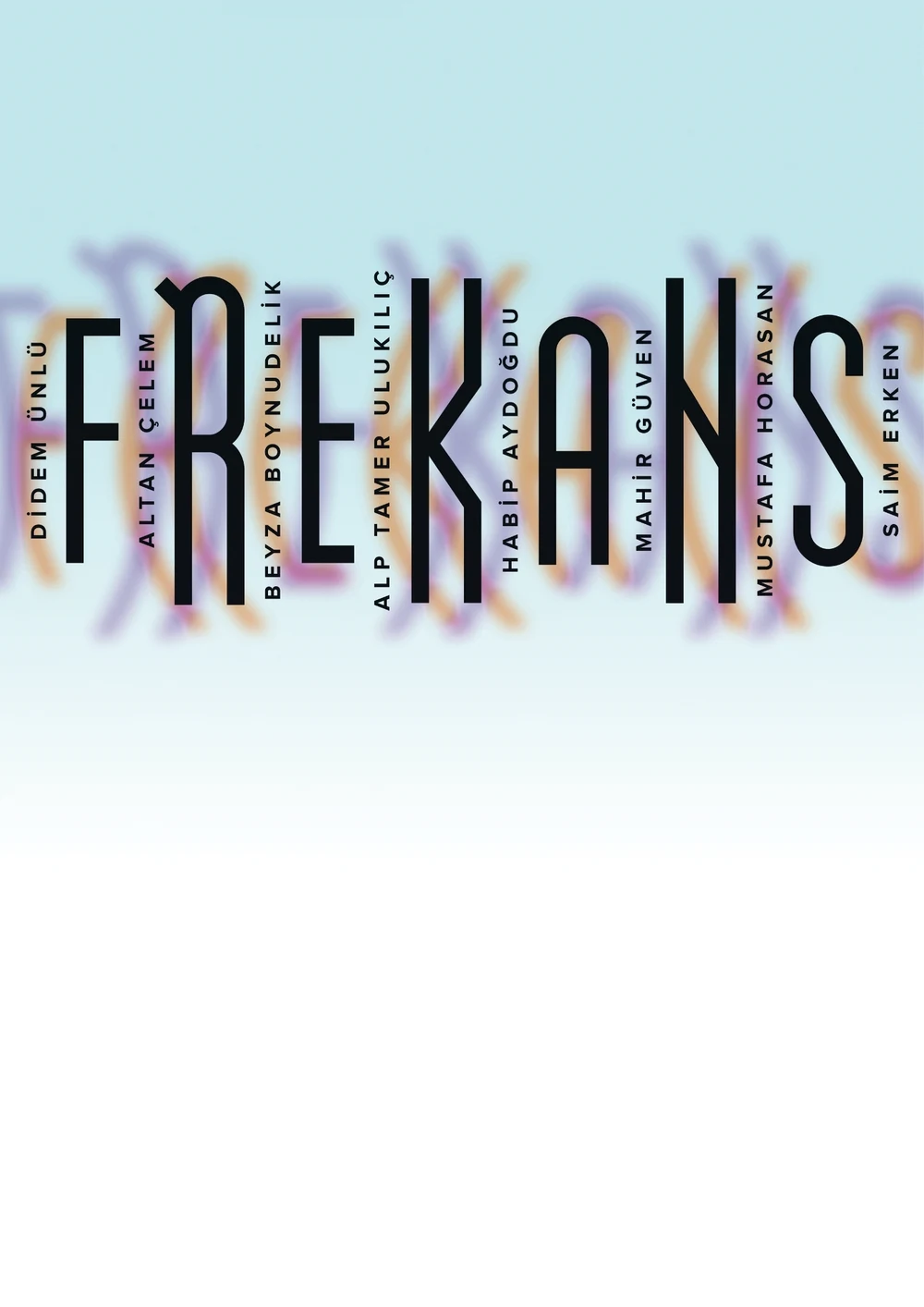
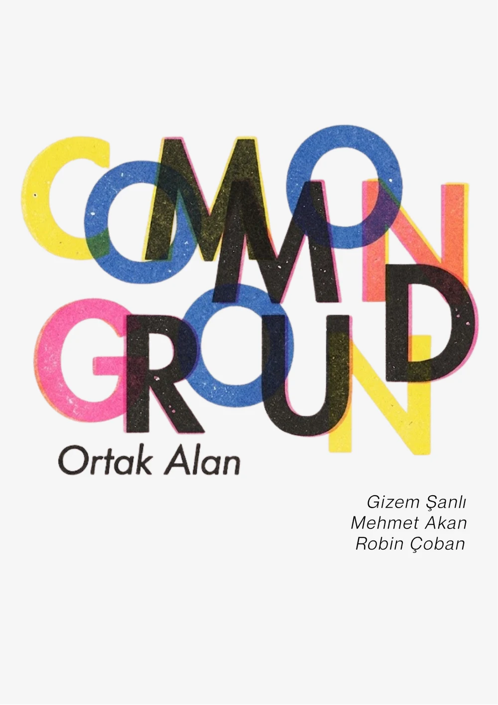
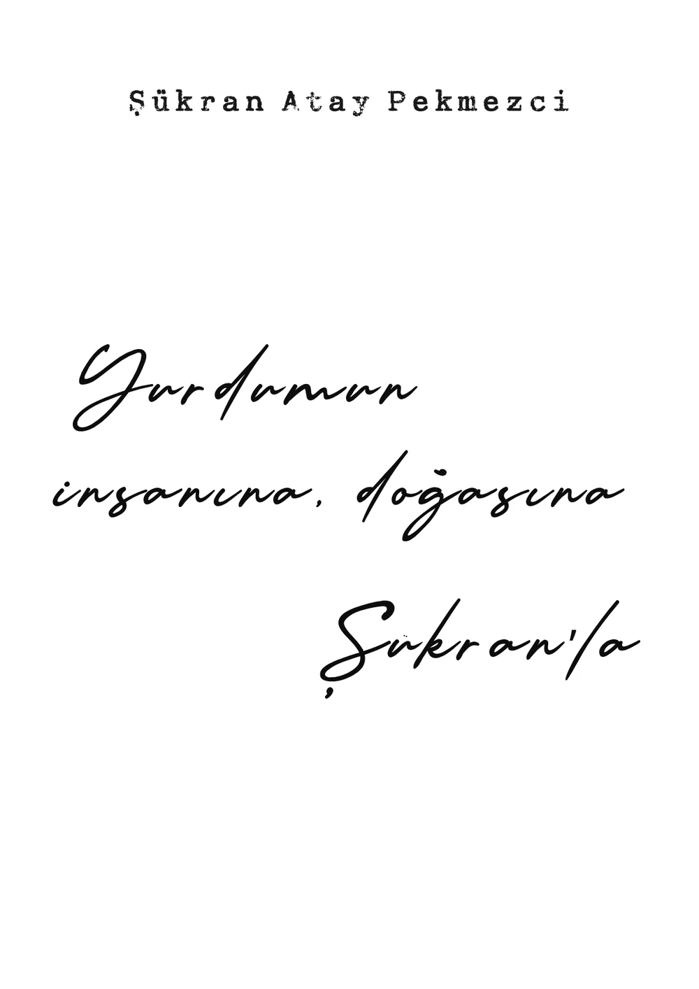
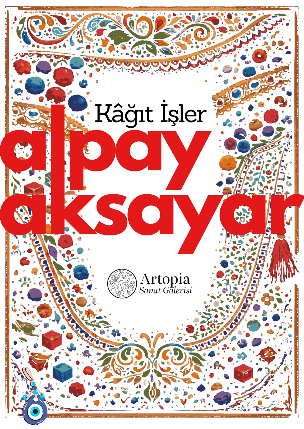
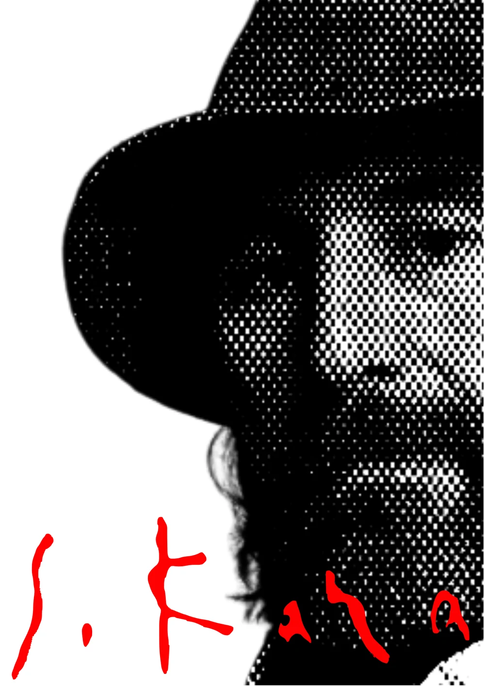
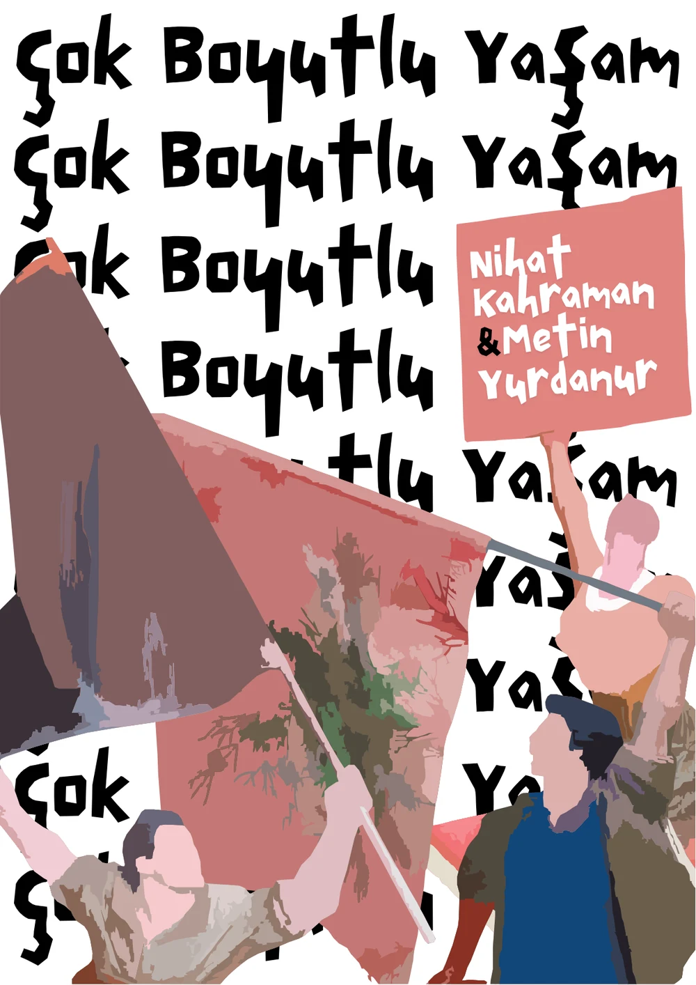
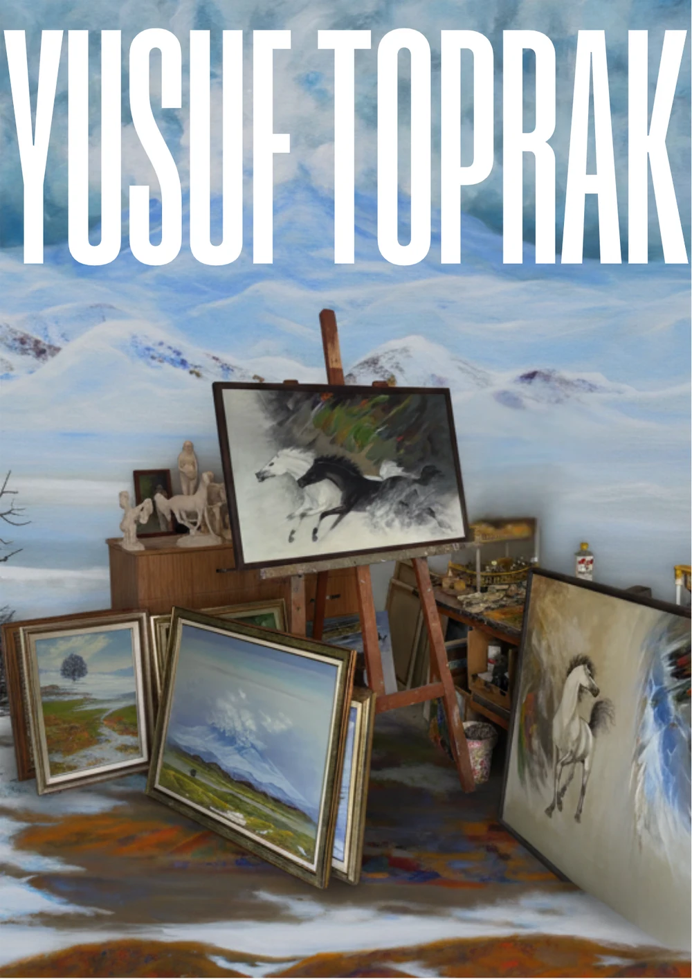
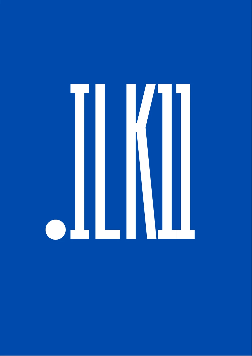
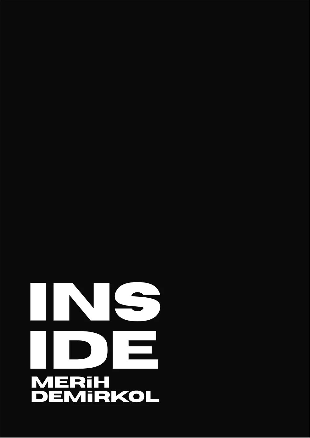
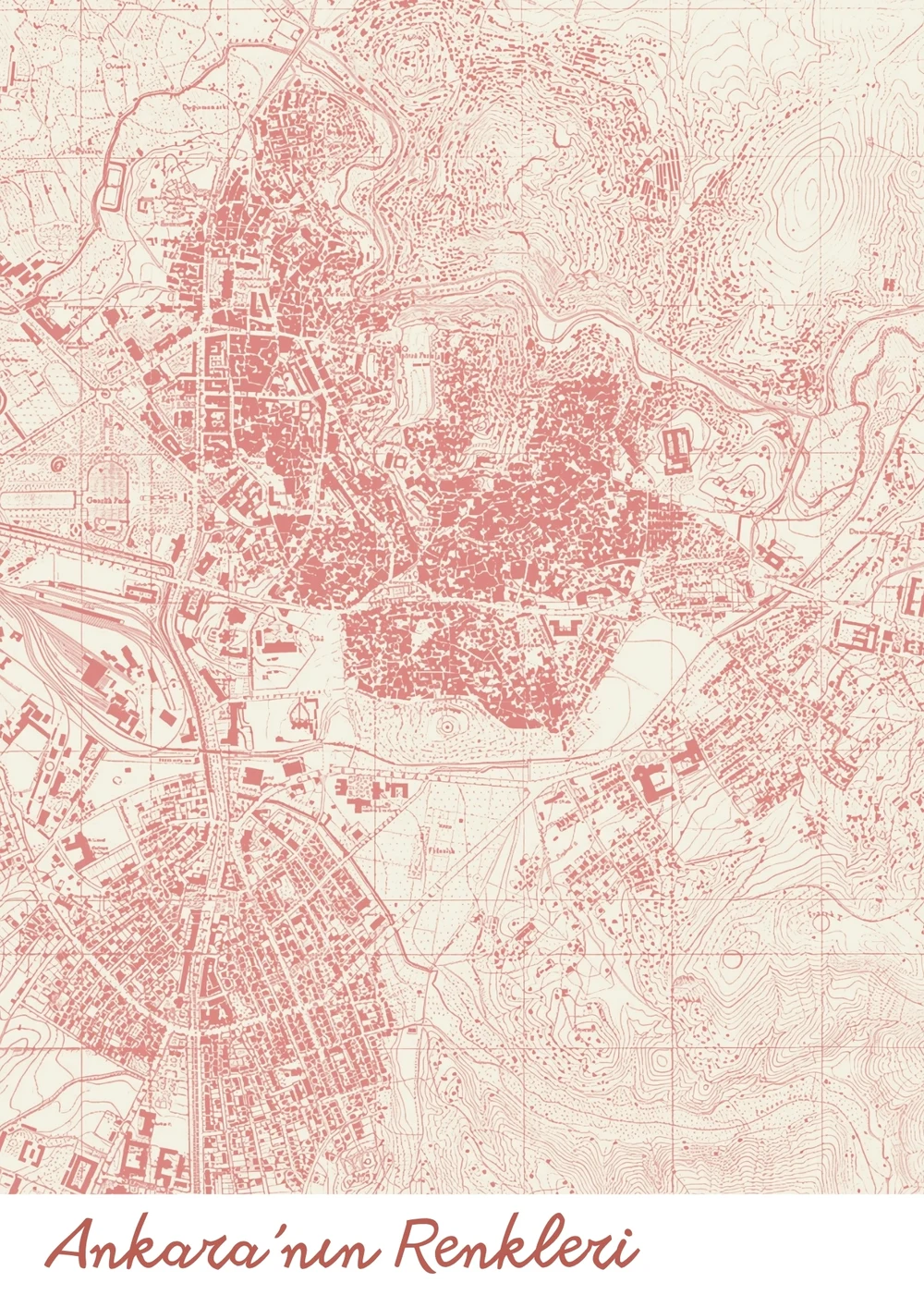
Eleven exhibitions, eleven poster concepts, each drawn from its artist and their work
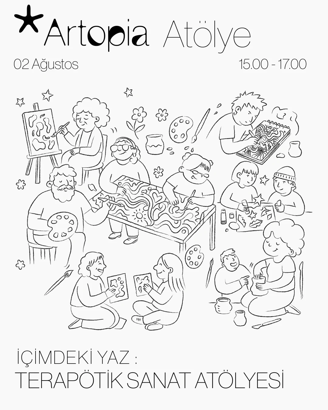
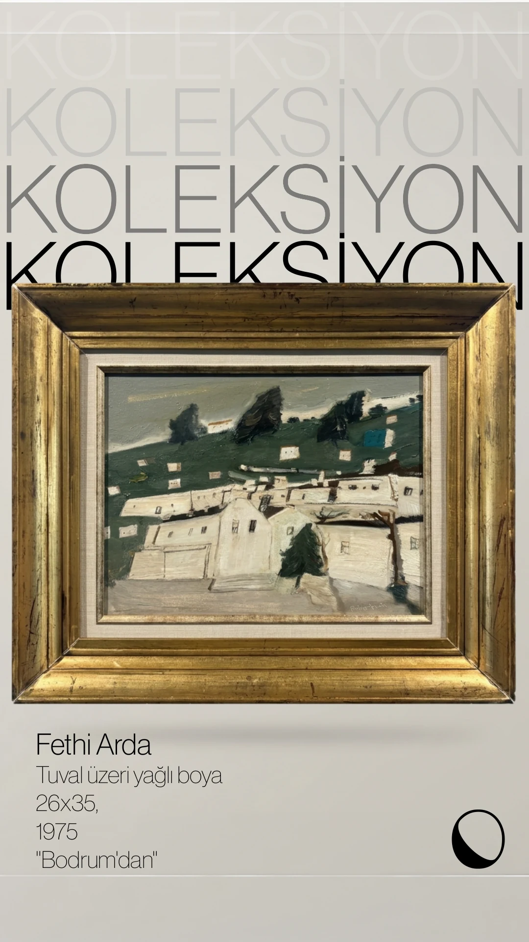
Beyond the exhibitions: Artopia Atölye, the workshop programme, with a star in place of the mark and my own line drawings; and Koleksiyon, a story series for works from the collection
Interested in working together?
© 2026 Deniz Yılmaz. All rights reserved.